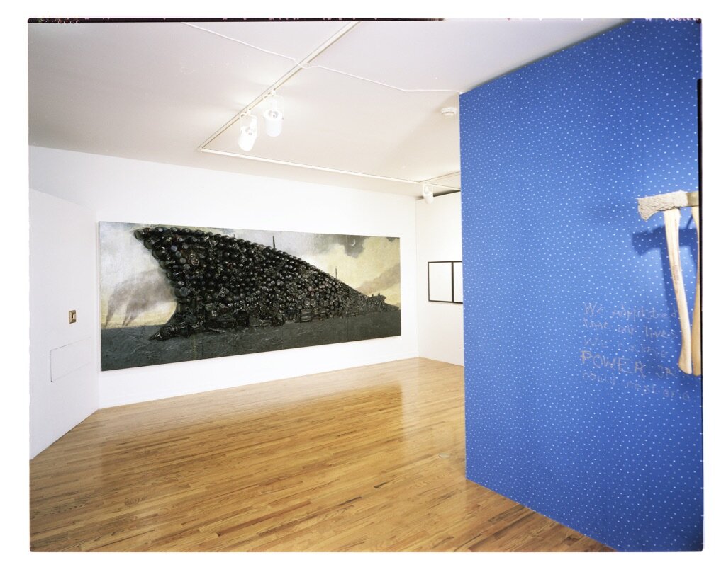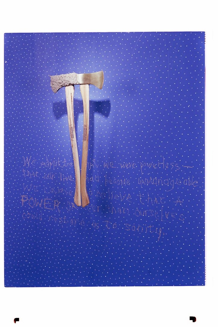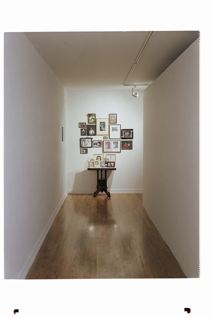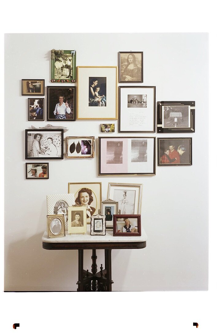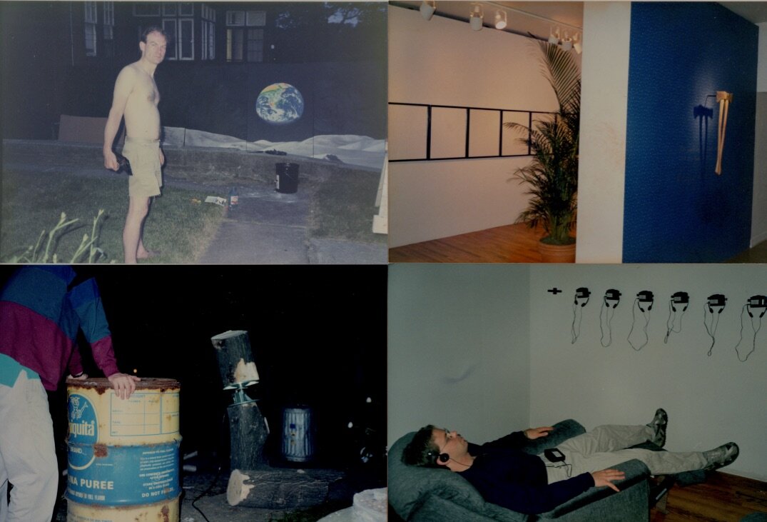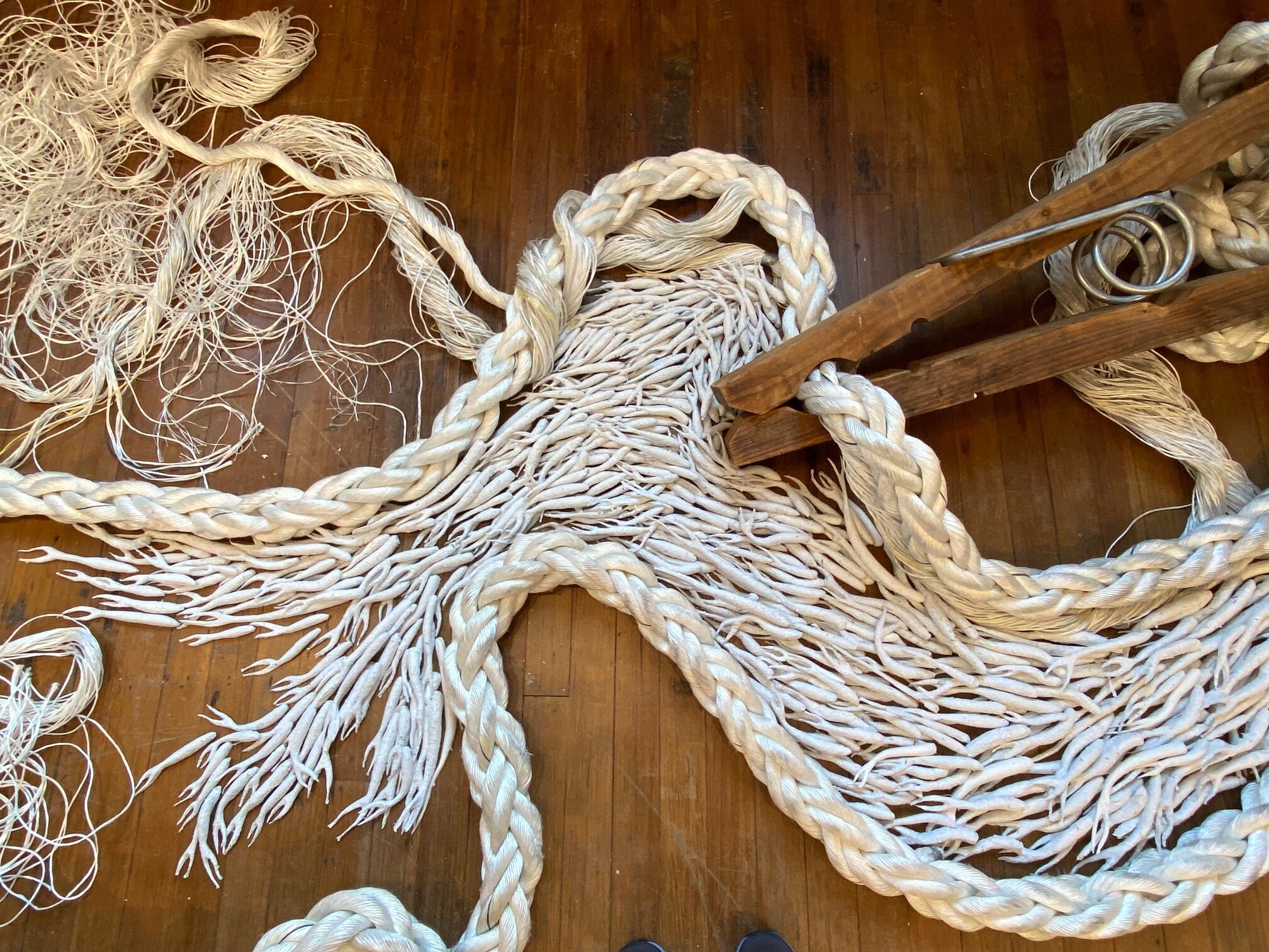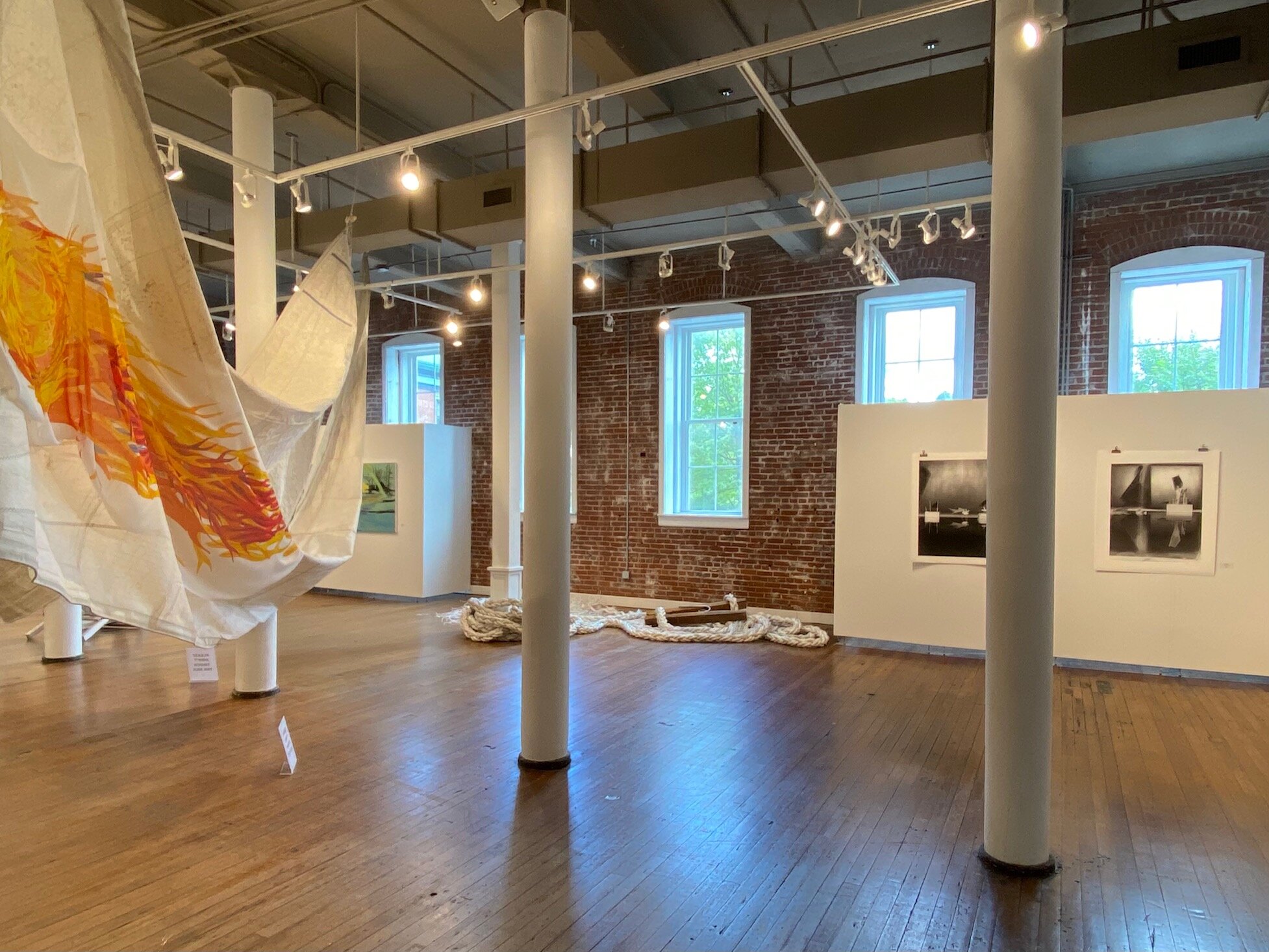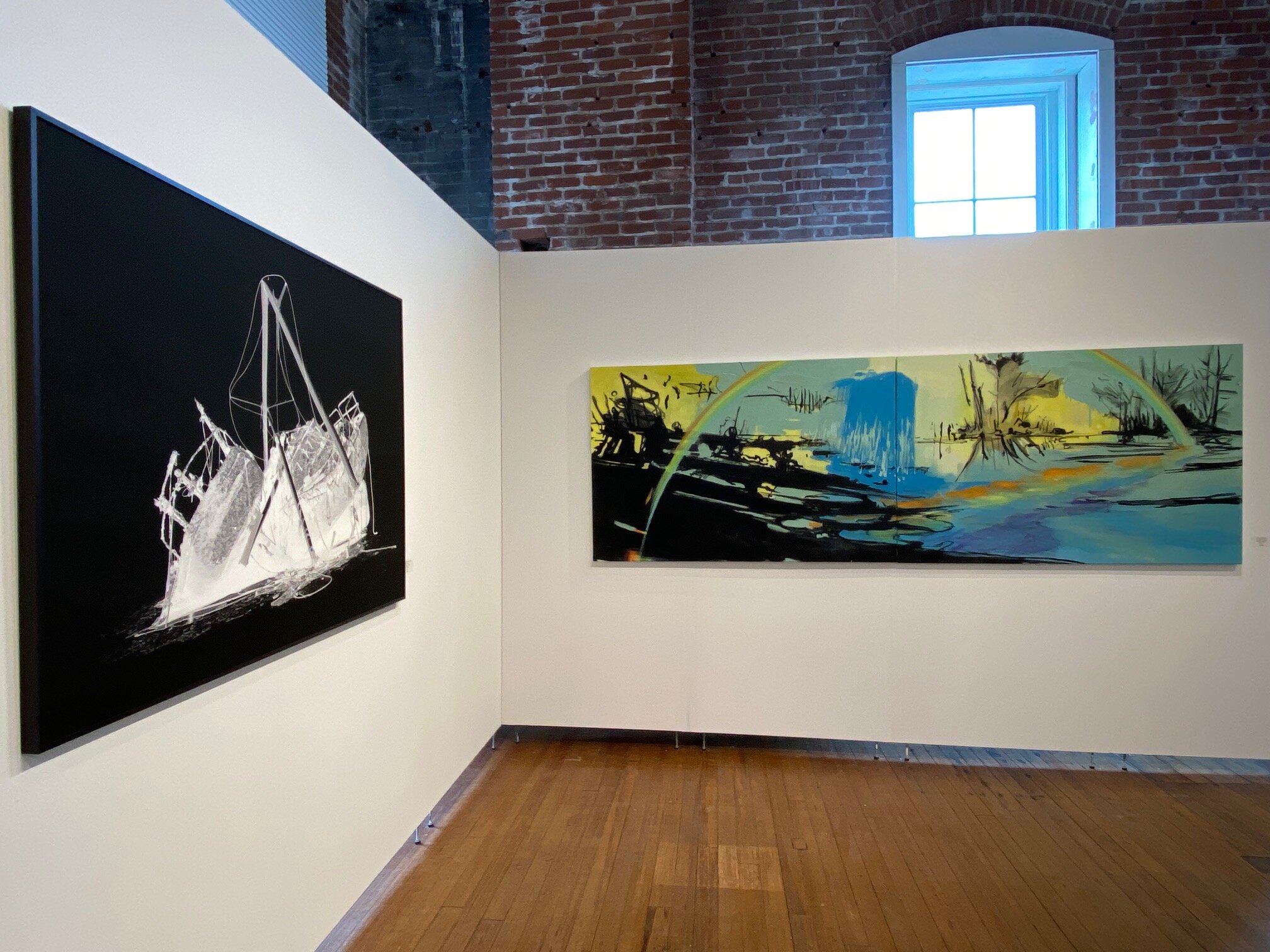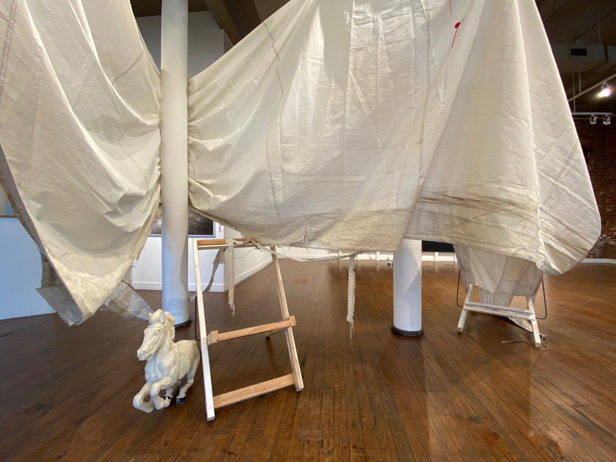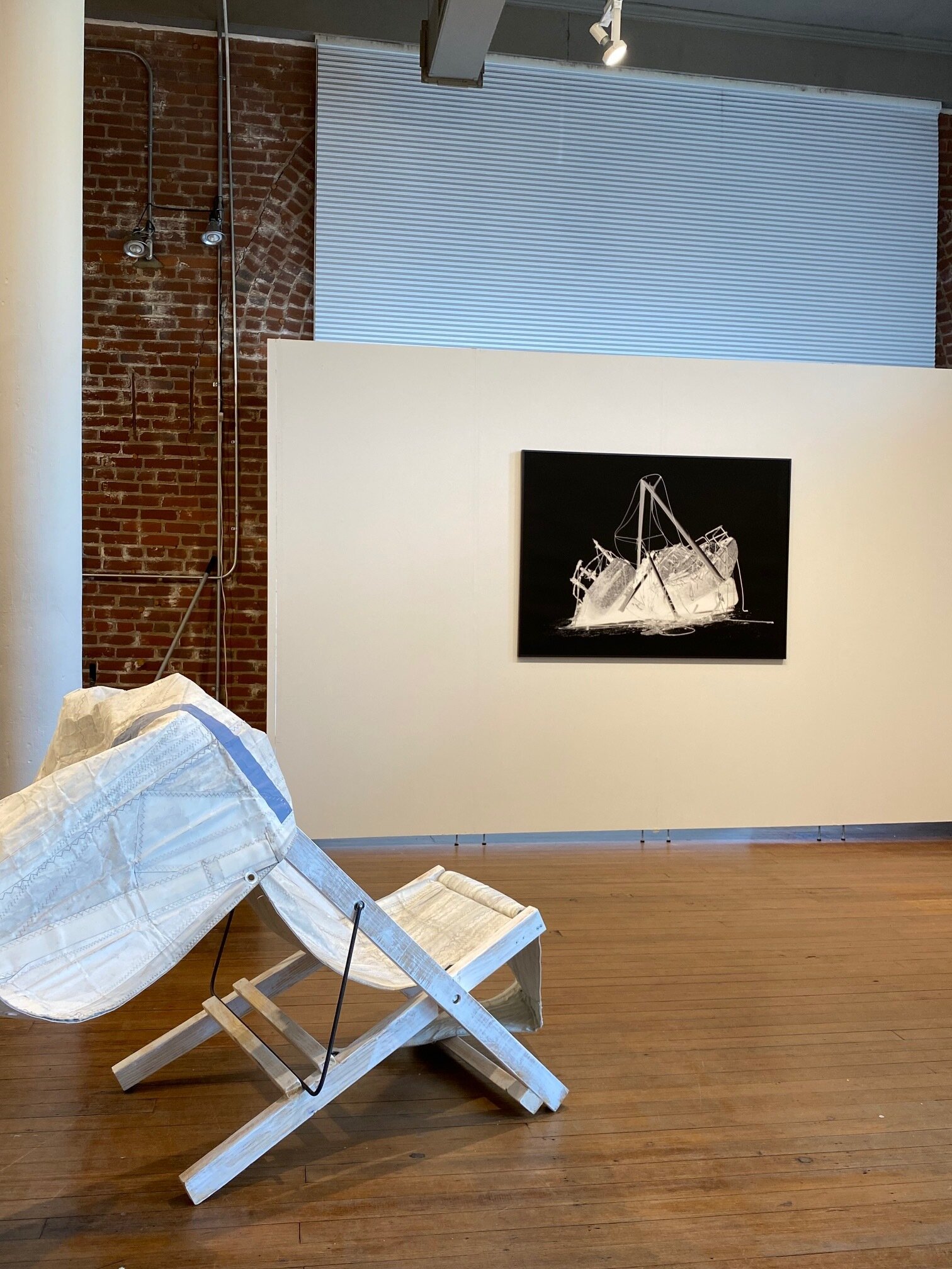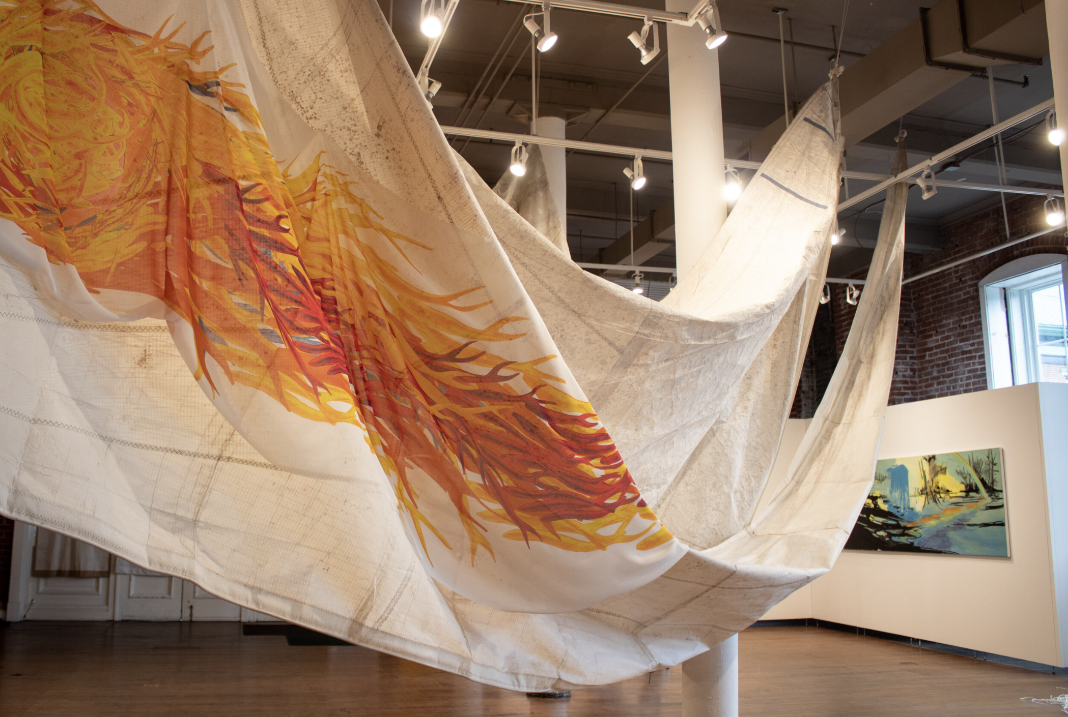
Atlantika Collective Member Sue Wrbican's show titled The Iridescent Yonder recently opened at the Riverviews Artspace in Lynchburg, VA and was reviewed in this space on July 14. During Atlantika's monthly meeting, Sue walked us through the multi-faceted show, which includes photography, painting, and installation. She emphasized that the exhibit was conceived as a response to the tragic loss of both her brother, Matt Wrbican, and her mother within several weeks of each other. In fact, the exhibit centers around a large-scale collaborative painting of an oil tanker created by her brother Matt and two collaborators, Phil Rostek and James Nelson, in 1991. During the walkthrough, we were introduced to Phil, who not only helped us to appreciate the importance of Matt Wrbican's accomplishments, but also regaled us with tales about collaborative efforts the group initiated in the 1980s under the name "DAX," or Digital Art Exchange. Phil's recollections of their joint efforts and the early responses of artists in the 1970s to 1990s to important cultural developments, including the advent of the internet, proved extremely fascinating, and we invited him to elaborate on the very significant "paradigm shift" that he witnessed in art during this period. We hope that this series of posts will not only shed light on innovations in American experimental art during this period, but also flesh out the relevance and significance of Sue's recent work. You can read Part One here.
By Phil Rostek
The decade of the 80’s brought about dramatic changes that impacted the social order in every conceivable way. Financial markets saw great shifts of wealth, employment became a learning curve that replaced routine, hierarchy in personal relationships saw great migrations of status and recognition. Professions morphed, identities scurried into mythologies, orientations of all kinds stood on their head. These tumultuous times, however, were lived - like all times are lived - day to day. The scale of what was happening was absorbed by the daily pressing details that one must naturally confront in order to get by. Underneath it all was a feeling of uncertainty. An anxiety instigated by the multiplicity of new things that were occurring and new things that had to be learned. On top of it all was a giddy excitement that enthusiastically embraced utopian possibilities. Possibilities that lent themselves not only to personal opportunity - but possibilities that could make the world a better place.
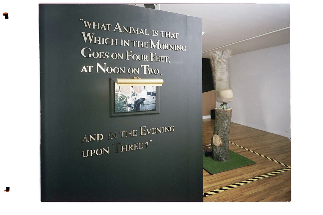
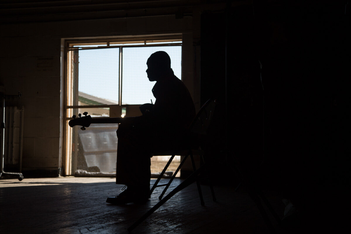
Artistically speaking, America seemed to be punctuated not by large chunks of sensibility that were later called movements; but rather abject change that was moving through time decade by decade. The 70’s were quite different from the 80’s; the 90’s would most likely bring more and faster change. Below is an image of Matt Wrbican starting his work on the Oil Tanker. The year was 1991. It was early in a new decade and it felt like it was early in a new decade. Art was in its primary role - not as a forecaster of what was to come - but as a perceiver of what was Actually transpiring in the present. Matt's graduate studies had resulted in an M.F.A. and Carnegie Mellon University endorsed him as a master of his art. Matt was on the fulcrum of what most of us remember with deeply etched feelings - a time in our own lives when very pivotal decisions are made. All preparation toward a future comes shockingly down to what Actually is going to happen. It was in that zone that Matt found himself in a basement fashioning a modern Minotaur.
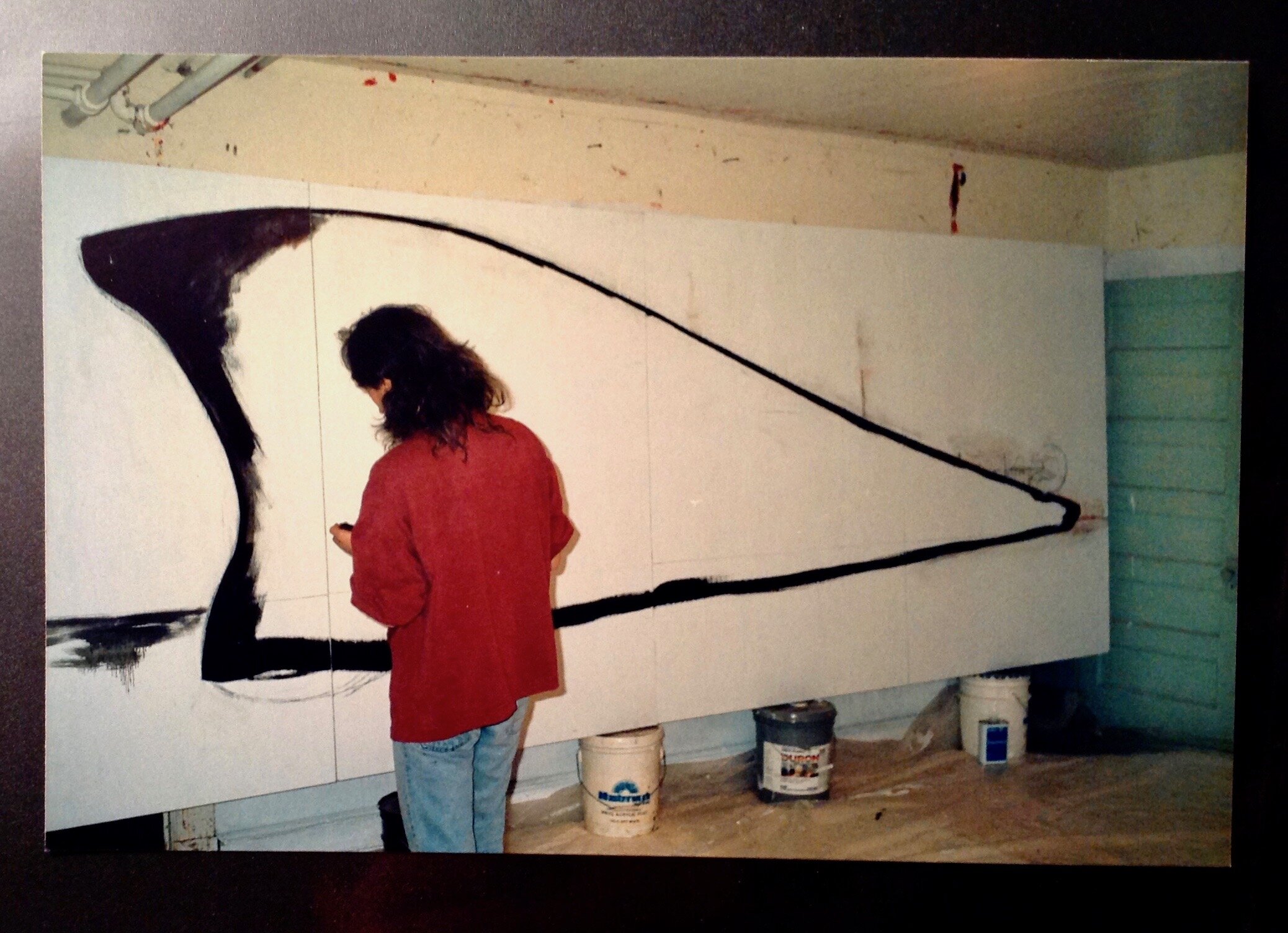
Matt Wrbican working on The Oil Tanker, 1991.
I take part of the responsibility for that. Matt and i were close friends. The DAX Group experience that i shared with Matt had me branching out too and i was firming up convictions that took about a decade to distill. I was moving toward a desire to do something more contained, more structured or planned. I had become fatigued by unchartered interactions that stemmed from untethered egalitarian ground rules. I was a relationship thinker who had become suspect of Relativism. Somehow the idea of an absolute seemed a return to something pleasant. i began questioning my own position within a tech-class society. Platitudes about how the world should be seemed to fall way too short. in a rather sober way, i acknowledged that my DAX theories were possible through technical expertise that i did not have at all. I was also seeking relief from the virtual world of a screen. i wanted to be a traditional stick in the mud.
In the 70’s i studied with this man, Robert Lepper, at Carnegie Mellon en route to my MFA:

Robert Lepper lighting a cigarette - late 80’s - from my DVD ‘Robert Lepper / a Personal View'
Lepper pausing to light a cigarette had become a signature gesture. It meant he was pausing to line up his thoughts; he was getting ready to “ think.” It had the quality of a mini drama - a theatrical event. Everybody called him Mr. Lepper, students, faculty, everybody. Mr. Lepper’s course ‘Individual and Social Analysis’ was the soul of the visual art program at CMU; just as it was years earlier when it was Carnegie Tech. One didn’t even have to study with Lepper one on one. His influence permeated the place. Arguably Lepper taught the first course in Industrial Design in the nation. He taught both in the design department and in the art department. Lepper saw little distinction between the two areas in my opinion. Andy Warhol would take his class that was then called Pictorial Design at Carnegie Tech. To put a point on a time frame, Andy graduated Tech in 1949 - the year i was born. I graduated CMU with an M.F.A. in 1973 - the year Picasso died.
Rainier Crone in his book about Warhol would draw attention to Lepper’s course problem: Locate the most significant object in the social flux. I think this is insightful and it should not be roundly dismissed. i think it is a salient factor in young Andy’s education… later to become a soup can, a Marilyn, a Brillo box. Lepper took pride in his ability to analyze. Some associate Lepper’s teaching with behaviorist psychology. He had an uncanny way of clarifying issues. By a spontaneous ability to contextualize, Lepper unveiled the origin of things. He gave reasons why things occurred; then gave reasons why they occurred when they did. My first year at CMU, with exposure to Lepper’s insights, would see me forego painting altogether. In my second year i would come back to school wearing white tie and tails.
The Oil Tanker also is inseparable from this man:

Bruce Breland in 1986 shortly after the DAX Group participated in the 1986 Venice Biennale.

Capturing van Gogh air for Bruce Breland’s “Museum of Modern Air” 1973'
Matt and i both studied with Bruce. Studying with Bruce was same as being friends with Bruce. He imposed no false sense of authority and imposed no academic standards that were purely academic. Bruce thought on high levels of thinking; his standards were measured by profound simplicity. He lived art and life together. In unison. Bruce compared expression, insight and commitment to Faulkner, Janice Joplin, Buckminster Fuller, Black Elk. He inspired others by story-telling about Black Mountain College, The Cedar Tavern, Allan Kaprow and ‘Fluids’ and about the career of his friend Roy Lichtenstein. Bruce Breland spoke from personal experience and personal involvement. He was a clairvoyant pioneer in the world of early telematic exchange. When the DAX Group was written up in an article in New Observations the group looked like this:

Photo by Jeff Breland , 1990.
Asking whether all this looping around and memory raking is extraneous or integral to an appreciation of the Oil Tanker is a legitimate thing to ask. Maybe it's a little of both. In that respect i confess that i like Niels Bohr and the whole idea of contradiction. Maybe matter does exist somewhere between a wave and particle and maybe his response to Einstein still stands up. Maybe we should not tell God what He does. i mention those things to you because they were mentioned to me by Mr. Lepper. He called Bohr’s response ‘the put down of the century.' If an artist is asked if he or she likes the color blue - the immediate response will be: “Next to what?” This is relationship not compartmentalized thinking. So i just put a feather in the hat of Relativism after all. In the spirit of Walt Whitman may i repeat this beautiful thought? You say i have contradicted myself? So i have contradicted myself. Within me is multitudes. If any of this makes sense, then the Oil Tanker might make sense. It also moves me to show the next picture. Me, my wife Marcia and Matt Wrbican at the Warhol gravesite:

Photo circa late 80’s
Let’s bring eternity into our conversation. After that visit to the graveyard, Matt and i shared an evening with the aging Lepper in his apartment. When Lepper saw our gravesite images he got very interested. The overarching point is that Matt and i were still learning from Lepper. I spent many hours in conversation with Lepper until the wee hours of the morning. His erudition, in old age, was astonishing. Did these discussions have a big influence on the Oil Tanker? Who would know. But by 2002 Matt was curating shows at the Warhol. Essay, co-authored by Robert Lepper and Philip Rostek, was included in an exhibition called Robert Lepper / Artist and Teacher.

Our thinking at the time of the Labyrinth did not reminisce; it attempted to be contemporary.

And that required the expertise and muscle of many people.

The show was ambitious and such collaborative enterprises were almost expected to fail. We made our deadline. It was not easy but we opened perfectly - dotting i’s and crossing t’s. We had learned the value of positive reinforcement as an empowering agent toward getting things done. An example of that, that pertains to the Oil Tanker specifically, is this note Jim wrote to Matt and i as he was finishing his section of the piece. It is exemplary of the glue that held the overarching and interacting parts together. i framed it not long ago.

We saw ourselves as idealistic and convivial representatives of what a new era could be.

The Labyrinth was perhaps more of a continuation of my grad school days than i care to admit. My graduate thesis, Tailormades, proclaimed that Art had 3 r’s. Ritual, Remnants. and Reminiscing. Remnants remain for me not failures or relics, but what remains after something has been removed. Ritual involves the mutual dependence of the components of a system. (Robert Lepper’s definition of Design.) And Reminiscing is what i am doing now.
I tried to live out those 3 elements while wearing my tails, my art uniform. i tried to re-invent those elements in the Labyrinth show. But the resurrection of the Oil Tanker is more than re-enactment for me. It beckons a search within - for some sense of self.
I had mentioned the term multiple identity in Chapter one. Perhaps the time is right to bring an explanation forward. I will try to do this pictorially as words seem beyond me. I am no match for Walt Whitman’s poetic gifts.

Artist Casting Giacometti shadow , 1972. Photo credit: Roger Dumas.
By the early 80’s i had become “phriar phil.”

Photo credit: Sue Wrbican
After a heart transplant in 2008 i became “philip the transplant.”
Art Attack, 1972 . Photo credit: Marcia Rostek
It is curious to have an extended life. To be alive via a donor’s heart is as surreal as Dali’s Persistence of Memory. This prophetic 1972 photo of a lip stick incision is probably even more strange to me than it is to you. After a heart transplant in 2008, I consider myself to be the ultimate “remnant.”
The Oil Tanker has arrived to see another day due to the convictions and energy and emotional feelings of Sue Wrbican. My doctors at Presbyterian Hospital in Pittsburgh have also enabled me to see another day. If Art has 3 r’s it would not surprise me. The ritual of bringing something to life, the phenomenon of recovery, and the opportunity to reminisce about the first two things - has happened to me in life and has happened to me in art. I would like to think my friend Robert Lepper would see beauty in the irony of it all. i would like to think that my friend Bruce Breland would hear the Sound and the Fury once more. i would like to think that Matt and Jim would see our Minotaur defeated. Defeated for perhaps a short time only. But defeated for now. Beyond that is too much to ask.

Myself seeing the Oil Tanker in storage after many years. Photo credit: Sue Wrbican, 2020.