Open Circle

My Two Wars

by Zhanna Ohanesian

I am only 21 years old and I have seen two wars in my life. The first, in my ancestral homeland, in Nagorno-Karabakh, the second – in Ukraine, where I was born and where I live. I tried to write this text to gather my own thoughts and tell you about how I am going through these wars.

The author aided children affected by the war in Nagorno-Karabakh in 2020. The conflict was the first of two she has experienced in her 21 years.

Black Garden or as the Armenians say – Artsakh

The war in Karabakh began in the fall of 2020. I would describe my feelings during the 44 days of the war in one word: agony.

During the war in Artsakh I did not want to live. I said to myself: am I worse than those 17-year-old, 20-year-old boys who are dying there now? I am not better than them. Why do I live and they do not? I said to myself: this is unfair.

It was hard for me. Hard to eat, sleep, study and work, as everyone else next to me in Ukraine did. People did not understand that my soul was in hell and I could not condemn them. I had no idea what others thought when they saw me, but I knew they could not even begin to imagine what was happening inside of me and how deeply terrible I felt. 

You have to volunteer if you do not want to become a complete madman

I volunteered during every single day of the 44-day war in Nagorno-Karabakh. Volunteering is throwing all your strength into a battle, squeezing it to the last drop.

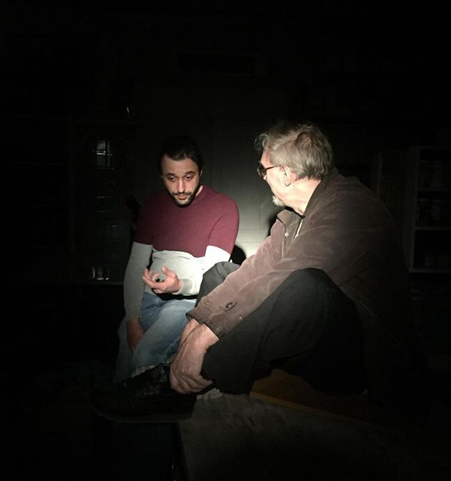
The author, Zhanna Ohanesian, poses with several other children she worked with during the aftermath of the Nagorno-Karabakh war.

I disseminated information, wrote to international organizations. I collected material aid for war victims and refugees.

During the Karabakh war, I was too young and too emotional. Everyday, I watched a lot of negative videos, wrote aggressive comments, entered into negative discussions on social media, and read a lot of news about death. I was killing my nervous system.

In wartime, it is more important than ever to be assembled, to store your energy, to direct it in the right way.

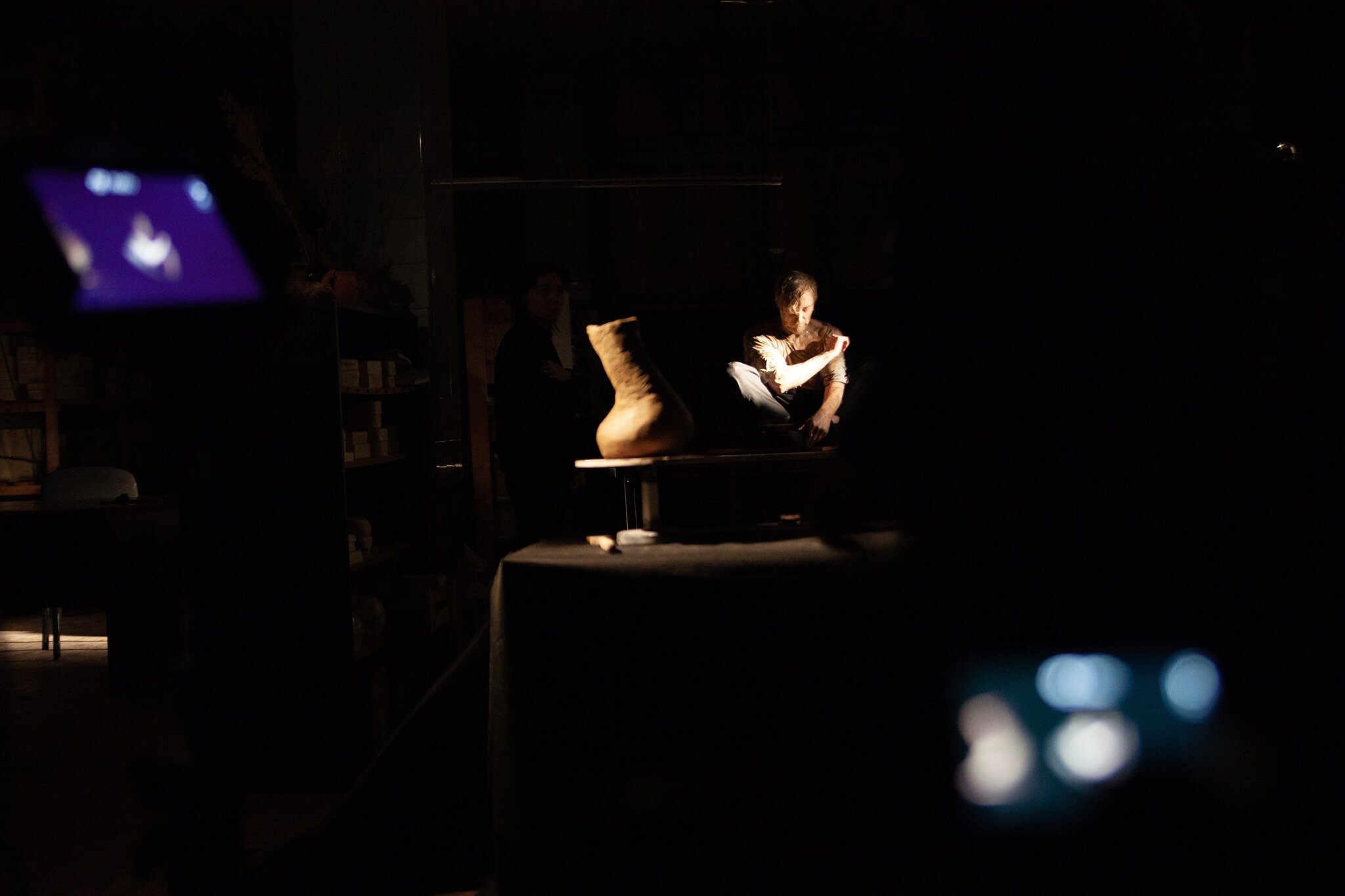
After the bloody war in Karabakh ended, we continued to help. In the spring, I realized I wanted to go to Armenia and work with children who were close to the war zone. My friend-volunteer and I went together.

We helped not only the children, but also ourselves. Such volunteering restored our faith and gave us peace of mind. It was a serious therapy for our soul that changed the way we had   lived.

Ukraine

I was already experienced when the war started in Ukraine. I knew what to do and I knew I would not influence the situation globally. Despite the fact that explosions were heard in my city every day and we were constantly in the bomb shelter – I was not afraid. I did not feel anything.

I knew: I just have to do everything I can. 

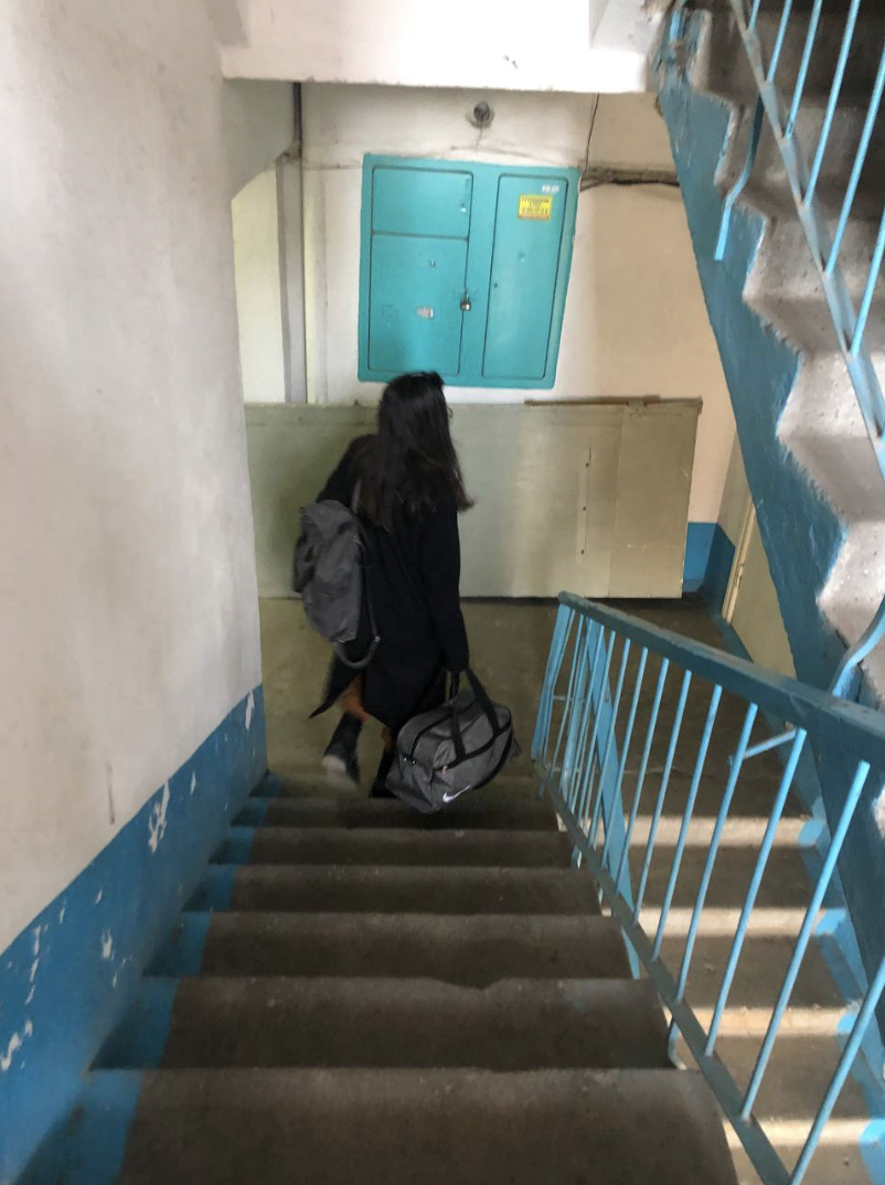
The author walks up and down the stairs, to and from the improvised bomb shelter in her hometown of Mykolaiv, Ukraine. A strategic southern port city, Mykolaiv has been shelled extensively and attacked repeatedly by Russian ground forces, but fierce resistance by Ukrainian troops has prevented Russia from capturing the city.

From the first day of the war, I opened my laptop and wrote to my friends, “What are you doing now? I'm joining". And we started working. We translated texts about the situation in Ukraine into other languages, helped in various charitable foundations, collected money for bulletproof vests and looked for humanitarian aid for those who needed it. 

It was not easy to do volunteer work in war conditions. My city of Mykolaiv is also a combat zone – the constant sirens and explosions and bad news distracted me from my work. With each sound of the siren, my family and I descended from the ninth floor to the shelter. Finally, on the 43rd day of the war, my family and I decided to evacuate to a safer city in Ukraine.

I heard explosions constantly. There have always been mixed feelings about this city. I have never been close to the mentality of people, their behavior and habits. Maybe it is because I felt a little overwhelmed. However, at the same time, I have many wonderful memories connected with this city. First of all, these are the memories of friendship, books, studies and work. These are walks under the rain, parties, and photo shoots with a friend. It is a long search for yourself in the world.

During this war, I have a feeling of constant deja vu. Yes, it was something familiar. But now I am not 19 years old. I react calmly when I read death statistics, when I see destroyed infrastructure. It’s strange to say, but this time I came to terms with human pain. However, I do not understand: is it a state of acceptance of the situation or a state of disappointment?

When the war comes, you do not care about material things, you do not care about your own  development. You just want peace. This is the same in any war.

War is a source of endless pain. It is possible to fight the pain if you just start to control the circumstances. Volunteering is perhaps the main way of fighting. 

Fate is unfair to my nation, to the country in which I was born and raised. I have no other choice but to struggle against injustice using selflessness and a desire to help those I love.

Post-Communist World: New Artists Add Their Voices in Support of Ukraine

Many members of Atlantika Collective have close ties to Ukraine and other post-Communist and Socialist states around the world. This week, as part of our response to the invasion of Ukraine by Russia, we issued a Special Statement on Ukraine, condemning the cruel and illegal invasion and urging strong actions to defend the country and to safeguard human lives that are in grave danger.

In addition, we unveiled a new section of our website, The Post-Communist and Socialist World, that highlights the many projects that members have created that originate in Ukraine or other nations of the world that have transitioned away from communism and socialism.

Now, other artists are joining us in support of Ukraine by adding links to their projects to this new section of the website. Today, we’re featuring the voices of two very talented artists, Victoria Crayhon and Matt Mooore, who have created beautiful and insightful projects in this part of the world.

Karl Marx Street I, Irkutsk RF 2018, Archival Pigment Print, 30 X 44 inches, Victoria Crayhon.

Victoria Crayhon has been making photographs in the Russian Federation since 2011. Her work examines the intensity and omnipresence of Russian nationalism as reflected in its architecture, public space, historical sites, holiday rituals, and culture in general, which, like any form of nationalism, is essentially the glorification of one’s own culture and country. Nationalism has historically, at least in the west, led to two world wars and most American wars since 1945. Her two projects, New Empire and Far East, ask the questions: How long can a society hold onto and/or reject ideas from its own history? Which facts and stories are being told? How is history wielded and for whom?

Post-Socialist Landscapes by Matt Moore is an exploration of memory sites in countries that were at one time occupied by the Soviet Union. The photographs in this project fall into two main groups. One set of images depicts the exact location where statues of Lenin and Stalin once stood. A second group of photographs focuses on the fate of the discarded communist monuments that once stood throughout Europe’s Eastern Bloc states. Together, these two groups of photographs speak to the way local governments and municipalities control historical narratives through the manipulation of public and private space. While some societies go to great lengths to eradicate the unwanted reminders of their past, others are willing to let them slowly disintegrate.

Lenin, Vilnius, Lithuania, Matt Moore, 2014.

Moore’s project East/West presents images of the abandoned checkpoints that separate former eastern bloc countries from the West, particularly the Czech Republic from Austria and Germany. As remnants of the Iron Curtain, each checkpoint carries with it its own amount of history and aura. Today, each structure stands vacant and serves only as a hollow reminder that one is moving from one country to another. Moore is interested in them as symbols of the perpetual change that takes place in Europe and beyond. Ultimately, the images in this project function like time capsules. They give us a glimpse of the past, while also hinting at the potential for greater change ahead.

In addition to featuring talented artists from around the world, our new section on the Post-Communist World contains information about how you can do your utmost to assist the people of Ukraine in their historic struggle for democracy and self-determination, including information on Russian war crimes, charities that are assisting Ukrainians in their country and those who have been forced to flee, and suggestions about how to contact government officials in the West who must hear from us about the importance of this crisis for the world.

We all have a stake in the war in Ukraine, since the very future of democracy is at stake. We continue to urge everyone to do all they can to influence the outcome.

The Oil Tanker (Part Three)

Atlantika Collective Member Sue Wrbican's show titled The Iridescent Yonder recently opened at the Riverviews Artspace in Lynchburg, VA and was reviewed in this space on July 14. During Atlantika's monthly meeting, Sue walked us through the multi-faceted show, which includes photography, painting, and installation. She emphasized that the exhibit was conceived as a response to the tragic loss of both her brother, Matt Wrbican, and her mother within several weeks of each other. In fact, the exhibit centers around a large-scale collaborative painting of an oil tanker created by her brother Matt and two collaborators, Phil Rostek and James Nelson, in 1991. During the walkthrough, we were introduced to Phil, who not only helped us to appreciate the importance of Matt Wrbican's accomplishments, but also regaled us with tales about collaborative efforts the group initiated in the 1980s under the name "DAX," or Digital Art Exchange. Phil's recollections of their joint efforts and the early responses of artists in the 1970s to 1990s to important cultural developments, including the advent of the internet, proved extremely fascinating, and we invited him to elaborate on the very significant "paradigm shift" that he witnessed in art during this period. We hope that this series of posts will not only shed light on innovations in American experimental art during this period, but also flesh out the relevance and significance of Sue's recent work. You can read Part One here and Part Two here.

by Phil Rostek

I was very happy to see the wonderful installation that the Oil Tanker received at the Craddock - Terry Gallery, Riverviews Artspace in Lynchburg. The Oil Tanker is comprised of four 6’ high by 4’ wide panels that are bolted together to make a 6’ high by 16’ wide surface. Matt and i were pretty deliberate in making something that would last; and the tanker survived 30 years of storage without much structural deterioration. It was stored in 2 commercial venues over the years - both were dry and climate controlled. The weight of the piece requires a solid wall for installation. To take the stress off the piece, the installation in Lynchburg supported the tanker in a rather ingenious way. I was delighted to see this beautiful presentation.

1-oil-tanker-on-wall.jpeg

As i wax philosophically about memories of long ago, i hope i do not digress into far-fetched tangents. I see relationships everywhere and to a fault. Even the posts that support the Oil Tanker in this photo evoke symbolic significance for me. Being a helpless grammarian, it raises these two words in my mind: Foundation and origin. My mentor Robert Lepper defined design in several ways; this is one that i remember: “Design is the mutual dependence of the components of a system.” For me the collaboration that brought the Oil Tanker into the world enjoyed additional creative input in Lynchburg that further described what the Labyrinth show aimed to suggest. The components of a system had further described the concept of distributed authorship. A foundation was provided that was integral to the practicality of need; yet remained within the mutual dependence of a system.

That thought raises implications about what we expect when we impose the notion of aesthetic into our consideration of most everything? Extraneous things, when removed, are perceived as improvements. The door then opens wider toward open ended thinking. It provides more room to take in more. When a system is efficiently contained, in the context of The Iridescent Yonder, it all becomes a component part within a larger schema. The very life of Sue Wrbican, the imagination and inclusion of Claire McConaughy, and the Oil Tanker all set sail together on some voyage into a 3 person installation:

From Sue Wrbican’s installation “The Iridescent Yonder” at Riverviews Artspace in Lynchburg, VA.

From Sue Wrbican’s installation “The Iridescent Yonder” at Riverviews Artspace in Lynchburg, VA.

Fragile Rainbow, Claire McConaughy, 120” x 40,”  2021.

Fragile Rainbow, Claire McConaughy, 120” x 40,” 2021.

If art and life are indeed a unison (or are at least believed to be a unison) and art and life together are considered to be an inseparable entity... relationship experience expands to appreciate subjectivity within a guarded attitude that is respectful of, not fearful of, subjectivity. I believe it is that zone that empowered Sue Wrbican to take on the The Iridescent Yonder. The loss of a mother and a brother, especially if we have shared similar trauma, needs little explanation. The impulse to place that in full view via the creative act stands close to what we all know, what we have all have felt, what we all call up in our hearts from time to time. The will to celebrate being alive in the midst of those considerations brings the term “Yonder” into rather sharp focus. Art and Life ponders eternity without apology and without a “look back,” as Claire said in her painting, “Fragile Rainbow.”

Plan for Labyrinth exhibition, Phil Rostek and Matt Wrbican, 1990.

Plan for Labyrinth exhibition, Phil Rostek and Matt Wrbican, 1990.

The Oil Tanker was a portion of a larger show called the Labyrinth which closed with a long hallway. The wall and table presented pictures of the participating artist's mothers. My mother was alive then. Now i join Sue in the iridescent Yonder of recollection.

4-long-hallway-with-photos.jpeg

The awareness of experience as it is lived can include an awareness of some larger gestalt. This has engaged the minds of great thinkers throughout the centuries. Times of insight. Those times when things seem clear. Those times when you see yourself in the bathroom mirror - when you see what is there - not a memory that avoids the stark truth of what time has done to a face. Art can take us to this awareness. Art can move us into a receptivity to awareness. It can beckon us to engage the Yonder.

Ocracoke Path, Sue Wrbican, 53 1/4“ X 40 1/4”, 2017.

Ocracoke Path, Sue Wrbican, 53 1/4“ X 40 1/4”, 2017.

This is a view of that awareness, that disappearing path, that acknowledgement that things, including ourselves, move through time.

And so the sails that propel us through our lives are given pause in this presentation. Easy chairs help to anchor the sails. A reference to repose, a reference to times when there is time enough to step back and look at life, a look that seeks the mind not just the spirit. In my opinion this is more about analysis than it is about simplistic capitulations to recollection.

Sue speaks of a show where she includes her friends - as a way of getting a message out. In classic artistic reservation she does not spell out her opinion any further than that. There are only two friends in the Iridescent Yonder show. Both have to do with the show’s intent. Both were selected with care. Both retained a life of their own while mixed into relationship that was aimed at expressing the ineffable.

This is quite compatible with thought processes that were employed in making the Oil Tanker. Three artists acting in concert and acting with autonomy - at the same time. The desire is to avoid premature conclusions and the temptation of self proclamation.

I close with this image from the Labyrinth show. It is a wing wall reference to the Oedipus riddle. The picture on the wall (that Matt Wrbican chose) depicts Sue, as a child in a party dress, running past her grandfather who is holding a cane. It is gesture that unnerves me a bit. It is so much in keeping with the sensibility of Matt Wrbican and the fusion of art and life that i have enjoyed with Matt and Sue over many years. I also knew Matt’s dear mother. i also knew her cats and her garden and her intellect.

From the Labyrinth Exhibition, 1991.

From the Labyrinth Exhibition, 1991.

The Oil Tanker (Part Two)

Atlantika Collective Member Sue Wrbican's show titled The Iridescent Yonder recently opened at the Riverviews Artspace in Lynchburg, VA and was reviewed in this space on July 14. During Atlantika's monthly meeting, Sue walked us through the multi-faceted show, which includes photography, painting, and installation. She emphasized that the exhibit was conceived as a response to the tragic loss of both her brother, Matt Wrbican, and her mother within several weeks of each other. In fact, the exhibit centers around a large-scale collaborative painting of an oil tanker created by her brother Matt and two collaborators, Phil Rostek and James Nelson, in 1991. During the walkthrough, we were introduced to Phil, who not only helped us to appreciate the importance of Matt Wrbican's accomplishments, but also regaled us with tales about collaborative efforts the group initiated in the 1980s under the name "DAX," or Digital Art Exchange. Phil's recollections of their joint efforts and the early responses of artists in the 1970s to 1990s to important cultural developments, including the advent of the internet, proved extremely fascinating, and we invited him to elaborate on the very significant "paradigm shift" that he witnessed in art during this period. We hope that this series of posts will not only shed light on innovations in American experimental art during this period, but also flesh out the relevance and significance of Sue's recent work. You can read Part One here.

By Phil Rostek

The decade of the 80’s brought about dramatic changes that impacted the social order in every conceivable way. Financial markets saw great shifts of wealth, employment became a learning curve that replaced routine, hierarchy in personal relationships saw great migrations of status and recognition. Professions morphed, identities scurried into mythologies, orientations of all kinds stood on their head. These tumultuous times, however, were lived - like all times are lived - day to day. The scale of what was happening was absorbed by the daily pressing details that one must naturally confront in order to get by. Underneath it all was a feeling of uncertainty. An anxiety instigated by the multiplicity of new things that were occurring and new things that had to be learned. On top of it all was a giddy excitement that enthusiastically embraced utopian possibilities. Possibilities that lent themselves not only to personal opportunity - but possibilities that could make the world a better place.

Artistically speaking, America seemed to be punctuated not by large chunks of sensibility that were later called movements; but rather abject change that was moving through time decade by decade. The 70’s were quite different from the 80’s; the 90’s would most likely bring more and faster change. Below is an image of Matt Wrbican starting his work on the Oil Tanker. The year was 1991. It was early in a new decade and it felt like it was early in a new decade. Art was in its primary role - not as a forecaster of what was to come - but as a perceiver of what was Actually transpiring in the present. Matt's graduate studies had resulted in an M.F.A. and Carnegie Mellon University endorsed him as a master of his art. Matt was on the fulcrum of what most of us remember with deeply etched feelings - a time in our own lives when very pivotal decisions are made. All preparation toward a future comes shockingly down to what Actually is going to happen. It was in that zone that Matt found himself in a basement fashioning a modern Minotaur.

Matt Wrbican working on The Oil Tanker, 1991.

Matt Wrbican working on The Oil Tanker, 1991.

I take part of the responsibility for that. Matt and i were close friends. The DAX Group experience that i shared with Matt had me branching out too and i was firming up convictions that took about a decade to distill. I was moving toward a desire to do something more contained, more structured or planned. I had become fatigued by unchartered interactions that stemmed from untethered egalitarian ground rules. I was a relationship thinker who had become suspect of Relativism. Somehow the idea of an absolute seemed a return to something pleasant. i began questioning my own position within a tech-class society. Platitudes about how the world should be seemed to fall way too short. in a rather sober way, i acknowledged that my DAX theories were possible through technical expertise that i did not have at all. I was also seeking relief from the virtual world of a screen. i wanted to be a traditional stick in the mud.

In the 70’s i studied with this man, Robert Lepper, at Carnegie Mellon en route to my MFA:

Robert Lepper lighting a cigarette - late 80’s - from my DVD ‘Robert Lepper / a Personal View'

Robert Lepper lighting a cigarette - late 80’s - from my DVD ‘Robert Lepper / a Personal View'

Lepper pausing to light a cigarette had become a signature gesture. It meant he was pausing to line up his thoughts; he was getting ready to “ think.” It had the quality of a mini drama - a theatrical event. Everybody called him Mr. Lepper, students, faculty, everybody. Mr. Lepper’s course ‘Individual and Social Analysis’ was the soul of the visual art program at CMU; just as it was years earlier when it was Carnegie Tech. One didn’t even have to study with Lepper one on one. His influence permeated the place. Arguably Lepper taught the first course in Industrial Design in the nation. He taught both in the design department and in the art department. Lepper saw little distinction between the two areas in my opinion. Andy Warhol would take his class that was then called Pictorial Design at Carnegie Tech. To put a point on a time frame, Andy graduated Tech in 1949 - the year i was born. I graduated CMU with an M.F.A. in 1973 - the year Picasso died.

Rainier Crone in his book about Warhol would draw attention to Lepper’s course problem: Locate the most significant object in the social flux. I think this is insightful and it should not be roundly dismissed. i think it is a salient factor in young Andy’s education… later to become a soup can, a Marilyn, a Brillo box. Lepper took pride in his ability to analyze. Some associate Lepper’s teaching with behaviorist psychology. He had an uncanny way of clarifying issues. By a spontaneous ability to contextualize, Lepper unveiled the origin of things. He gave reasons why things occurred; then gave reasons why they occurred when they did. My first year at CMU, with exposure to Lepper’s insights, would see me forego painting altogether. In my second year i would come back to school wearing white tie and tails.

The Oil Tanker also is inseparable from this man:

Bruce Breland in 1986 shortly after the DAX Group participated in the 1986 Venice Biennale.

Bruce Breland in 1986 shortly after the DAX Group participated in the 1986 Venice Biennale.

Capturing van Gogh air for Bruce Breland’s “Museum of Modern Air” 1973'

Capturing van Gogh air for Bruce Breland’s “Museum of Modern Air” 1973'

Matt and i both studied with Bruce. Studying with Bruce was same as being friends with Bruce. He imposed no false sense of authority and imposed no academic standards that were purely academic. Bruce thought on high levels of thinking; his standards were measured by profound simplicity. He lived art and life together. In unison. Bruce compared expression, insight and commitment to Faulkner, Janice Joplin, Buckminster Fuller, Black Elk. He inspired others by story-telling about Black Mountain College, The Cedar Tavern, Allan Kaprow and ‘Fluids’ and about the career of his friend Roy Lichtenstein. Bruce Breland spoke from personal experience and personal involvement. He was a clairvoyant pioneer in the world of early telematic exchange. When the DAX Group was written up in an article in New Observations the group looked like this:

Photo by Jeff Breland , 1990.

Photo by Jeff Breland , 1990.

Asking whether all this looping around and memory raking is extraneous or integral to an appreciation of the Oil Tanker is a legitimate thing to ask. Maybe it's a little of both. In that respect i confess that i like Niels Bohr and the whole idea of contradiction. Maybe matter does exist somewhere between a wave and particle and maybe his response to Einstein still stands up. Maybe we should not tell God what He does. i mention those things to you because they were mentioned to me by Mr. Lepper. He called Bohr’s response ‘the put down of the century.' If an artist is asked if he or she likes the color blue - the immediate response will be: “Next to what?” This is relationship not compartmentalized thinking. So i just put a feather in the hat of Relativism after all. In the spirit of Walt Whitman may i repeat this beautiful thought? You say i have contradicted myself? So i have contradicted myself. Within me is multitudes. If any of this makes sense, then the Oil Tanker might make sense. It also moves me to show the next picture. Me, my wife Marcia and Matt Wrbican at the Warhol gravesite:

Photo circa late 80’s

Photo circa late 80’s

Let’s bring eternity into our conversation. After that visit to the graveyard, Matt and i shared an evening with the aging Lepper in his apartment. When Lepper saw our gravesite images he got very interested. The overarching point is that Matt and i were still learning from Lepper. I spent many hours in conversation with Lepper until the wee hours of the morning. His erudition, in old age, was astonishing. Did these discussions have a big influence on the Oil Tanker? Who would know. But by 2002 Matt was curating shows at the Warhol. Essay, co-authored by Robert Lepper and Philip Rostek, was included in an exhibition called Robert Lepper / Artist and Teacher.

ourthinkingatthetime2.jpg

Our thinking at the time of the Labyrinth did not reminisce; it attempted to be contemporary.

EXHIBIT-WITH-MOON2.jpg

And that required the expertise and muscle of many people.

The show was ambitious and such collaborative enterprises were almost expected to fail. We made our deadline. It was not easy but we opened perfectly - dotting i’s and crossing t’s. We had learned the value of positive reinforcement as an empowering agent toward getting things done. An example of that, that pertains to the Oil Tanker specifically, is this note Jim wrote to Matt and i as he was finishing his section of the piece. It is exemplary of the glue that held the overarching and interacting parts together. i framed it not long ago.

BETTER-QUALITY-NOTE.jpeg

We saw ourselves as idealistic and convivial representatives of what a new era could be.

The Labyrinth was perhaps more of a continuation of my grad school days than i care to admit. My graduate thesis, Tailormades, proclaimed that Art had 3 r’s. Ritual, Remnants. and Reminiscing. Remnants remain for me not failures or relics, but what remains after something has been removed. Ritual involves the mutual dependence of the components of a system. (Robert Lepper’s definition of Design.) And Reminiscing is what i am doing now.

I tried to live out those 3 elements while wearing my tails, my art uniform. i tried to re-invent those elements in the Labyrinth show. But the resurrection of the Oil Tanker is more than re-enactment for me. It beckons a search within - for some sense of self.

I had mentioned the term multiple identity in Chapter one. Perhaps the time is right to bring an explanation forward. I will try to do this pictorially as words seem beyond me. I am no match for Walt Whitman’s poetic gifts.

Artist Casting Giacometti shadow , 1972. Photo credit: Roger Dumas.

Artist Casting Giacometti shadow , 1972. Photo credit: Roger Dumas.

By the early 80’s i had become “phriar phil.”

Photo credit: Sue Wrbican

After a heart transplant in 2008 i became “philip the transplant.”

Art Attack, 1972 . Photo credit: Marcia Rostek

It is curious to have an extended life. To be alive via a donor’s heart is as surreal as Dali’s Persistence of Memory. This prophetic 1972 photo of a lip stick incision is probably even more strange to me than it is to you. After a heart transplant in 2008, I consider myself to be the ultimate “remnant.”

The Oil Tanker has arrived to see another day due to the convictions and energy and emotional feelings of Sue Wrbican. My doctors at Presbyterian Hospital in Pittsburgh have also enabled me to see another day. If Art has 3 r’s it would not surprise me. The ritual of bringing something to life, the phenomenon of recovery, and the opportunity to reminisce about the first two things - has happened to me in life and has happened to me in art. I would like to think my friend Robert Lepper would see beauty in the irony of it all. i would like to think that my friend Bruce Breland would hear the Sound and the Fury once more. i would like to think that Matt and Jim would see our Minotaur defeated. Defeated for perhaps a short time only. But defeated for now. Beyond that is too much to ask.

Myself seeing the Oil Tanker in storage after many years. Photo credit: Sue Wrbican, 2020.

Myself seeing the Oil Tanker in storage after many years. Photo credit: Sue Wrbican, 2020.

The Oil Tanker (Part One)

Atlantika Collective Member Sue Wrbican's show titled The Iridescent Yonder recently opened at the Riverviews Artspace in Lynchburg, VA and was reviewed in this space on July 14. During Atlantika's monthly meeting, Sue walked us through the multi-faceted show, which includes photography, painting, and installation. She emphasized that the exhibit was conceived as a response to the tragic loss of both her brother, Matt Wrbican, and her mother within several weeks of each other. In fact, the exhibit centers around a large-scale collaborative painting of an oil tanker created by her brother Matt and two collaborators, Phil Rostek and James Nelson, in 1991. During the walkthrough, we were introduced to Phil, who not only helped us to appreciate the importance of Matt Wrbican's accomplishments, but also regaled us with tales about collaborative efforts the group initiated in the 1980s under the name "DAX," or Digital Art Exchange. Phil's recollections of their joint efforts and the early responses of artists in the 1970s to 1990s to important cultural developments, including the advent of the internet, proved extremely fascinating, and we invited him to elaborate on the very significant "paradigm shift" that he witnessed in art during this period. We hope that this series of posts will not only shed light on innovations in American experimental art during this period, but also flesh out the relevance and significance of Sue's recent work.

by Phil Rostek

The Oil Tanker, a 1991 collaborative work by myself, Matt Wrbican, and Jim Nelson, has seen the light of day after 30 years of storage. Thanks to the energy, commitment, and creativity of artist Sue Wrbican (Matt’s sister), the Oil Tanker now looks like this in the Craddock - Terry Gallery at Riverviews Artspace in Lynchburg, VA. It enjoys a space within Sue’s exhibit entitled “The Iridescent Yonder."

Detail of The Oil Tanker, Matt Wrbican, Phil Rostek, and James Nelson. Discarded plastic objects, paint and tar, 192” x 72”, 1991.

Detail of The Oil Tanker, Matt Wrbican, Phil Rostek, and James Nelson. Discarded plastic objects, paint and tar, 192” x 72”, 1991.

The Oil Tanker was originally part of a larger presentation exhibited at the then Pittsburgh Center for the Arts, National Gallery. It was funded by the Painted Bride / Philadelphia and also was supported by the formidable commitment of director of exhibitions Mr. Murray Horne. The show was called the Labyrinth and it was a “walk through exhibit” - a kind of inventory of effects that intended to stimulate an observer to ponder speculations about what the world was like and where it might be going. In 1991 those conjectures most likely included many of the same thoughts that still plague us today and still require candor and inquiry, i.e., environmental concerns, sustainable resources, reasonable parameters of digital outreach, and the phenomenon of multiple identity.

The book of contributors to the Labyrinth exhibit (pictured below) included the conviction that, as organizers of the show, Matt and i considered ourselves “stewards,” not authors. The exhibit included a spinning tree and microphone which looped anything that was said into it. It included wise sentences from historical personalities that were scribed by hand as small as possible. Other rooms included audio tapes and lazy boy chairs, references to Shakespeare, the Ancient Greeks, Alcoholics Anonymous, and a video of Lower East Side metal banging in the Rivington Street “sculpture garden.”

Installation views, The Labyrinth, 1991.

The backstory of Oil Tanker is rather integral to a collaborative effort that included 14 artists all in all. The thrust of the exhibit attempted to laud the virtues of what i called “structural collaboration.” Quite simply that referred to my bias that overt process orientation prioritizes the participants - observers are for the most part left alone to untangle impenetrable interaction. The Oil Tanker may provide a good example to make this more clear.

I thought our Labyrinth should have a “Minotaur” and that was, in my opinion, oil and the amount of it that suffered catastrophic spills back then. Matt and i agreed on this and we invited Jim Nelson to help us express something, somehow. By consensus we agreed a tanker in high profile would fit the bill and agreed upon a rough thumb nail sketch. Later there was a separation of input. I did the tarry water, Matt worked inside the outline of the boat, and Jim painted a background setting.

Here’s me with the initial idea.

Phil Rostek standing with the original concept drawing for The Oil Tanker, 1991.

Here’s Jim Nelson painting in the background, which evoked The Gulf War. I met Jim at Carnegie Mellon University in 1971. Our graduate student studios were in the basement of the Margaret Morrison Building on campus. We remain very close friends to this day. I’m pictured also - touching up the tar at the bottom of the painting.

Jim Nelson and Phil Rostek creating The Oil Tanker in 1991.

And here is the creativity of Matt Wrbican who saved oil based products for months and then organized them from thin to high dimension within the hull of the Tanker. Neither i nor Jim was expecting the passion that Matt brought to the project; but i was not surprised then nor am i now. Matt Wrbican was a unique and stellar talent.

Plastic (petroleum-based) objects collected by Matt Wrbican for use in the creation of The Oil Tanker, 1991.

There is something ineffable about my experience in Lynchburg. It haunts me in ways that evoke, or perhaps better, reawaken the aspirations of The Labyrinth. Seeing the Oil Tanker but not seeing Matt was telling. The Labyrinth exhibition coincided with the retirement of my mentor and Matt’s mentor - Bruce Breland. I studied with Bruce as a grad student at CMU 1971 to 73. We did mail art and concept pieces together. i had given up lyrical painting and opted to wear white tie and tails to school every day. I was also studying with Robert Lepper - a teacher of Andy Warhol. Between Lepper and Breland is a volatile and heady place to be. Each had a keen sense of the absurd, and at the same time, each had a keen penchant for very pragmatic thinking. Both liked Duchamp. My leanings toward Fluxus would later inform my thinking when i wrote theory for Bruce Breland’s DAX Group (Digital Art Exchange) in the 80’s.

Phil Rostek, from a photograph by Bruce Breland, 1973.

Phil Rostek, from a photograph by Bruce Breland, 1973.

It was in the 80’s that i met Matt Wrbican. Matt was then a grad student working with Bruce in coursework called “intermedia.” During the decade of the 80’s the DAX Group contributed to many distributed authorship pieces during the early days of the internet. La Plissure du Texte 1983, a text exchange organized by Roy Ascott comes to mind - as do contributions to Network Planetario / Laboratorio Ubique at the Venice Biennale 1986.

By the end of the decade Matt was working at the Carnegie Museum of Art during the installation of a Carnegie International, archiving Breland’s legacy at CMU, and doing the Labyrinth show with me -all at the same time. It was stressful for Matt but he succeeded in doing it all. He was, very shortly afterward, hired by the Warhol Museum as an archivist in charge of moving work from Warhol’s factory to Pittsburgh. Matt is identified with the Warhol time capsules as well acknowledged as one of the foremost authorities about the life and art of Andy Warhol in the world. That is not an overstatement.

As i step back now and think about the volatility of those times; i cannot say that i have much to contribute to the understanding of it all. Great turmoil was let loose when “the individual was replaced by the collective’” via technological innovations; innovations that spawned an unprecedented acceleration of information. Information speed-up continues to shape the world and the people who live on it. The relationship between art and life seemed obvious when NYC was a center. The very notion of a center continues to fade into a horizontal world that runs flat. The Labyrinth tried to anticipate what future existence would be, and the Oil Tanker was something that seemed necessary to avoid and replace.

More installation views of The Labyrinth exhibit, 1991.

It seems that having one foot in a national world and one foot in a global one - is a chasm that has not narrowed but widened.

As science takes the place of art and religion, one area seems impervious to any form of apprehension. If i could replace the Oil Tanker in today’s Labyrinth, if i could speculate about Minotaurs today, i would offer this. The one area where there has been no “progress” or even significant conjecture is: an understanding of what consciousness actually is. We know it’s what disappears under anesthesia, but we don’t know much more than that. Science would deny that dead things have it at all. But when it is present as a combination of multi-sensory experience and flux - what we commonly call life - it seems to avoid science’s favorite word: “someday.”

It is curious when the notion of “what” is eclipsed by the notion of “how.” Hyper-individualistic living begins to fear time itself. Humility becomes obsolete. A culture, or the tribal equivalent of it, comes to think that time can be reversed and, moreover, that it can be reversed in the spirit of righteousness. The effect of information overload does not see the imminent dangers of the present; it ironically draws obsessive attention to the past. Somewhere in the meat of the brain there is a capacity to recall times that have gone by - but in today’s culture this can only be noticed in the context of the present.

What do contemporary people do when eternity itself has become a thing of the past? That is what i felt when i saw the Oil Tanker after all these years. That faint glimmer of who i used to be seemed unusually informative. That feeling is connected to the elusive charms of what we call, for lack of a better term, art.

And the Winner Is: Uh Huh

The music video created by Atlantika members Gabriela Bulisova and Mark Isaac for Joy on Fire’s hard-hitting song about gun violence in the United States, Uh Huh, continues to tear up the festival circuit and has now garnered its first all-out win: The Obskuur Ghent Film Festival in Belgium. Moreover, it just won the runner-up award at the Brighton Rocks Film Festival in the UK as well. Overall, it’s received awards at more than a dozen international film festivals…so far! Here are the band’s thoughts (as expressed by lyricist and vocalist Dan Gutstein):

Joy on Fire music video for “Uh Huh” wins Best Music Video category at Obskuur Ghent Film Festival (Belgium) and garners Runner-up accolades at Brighton Rocks Film Festival (UK)

Dan Gutstein

In a dream I don’t want you to know about, “Uh Huh” plays overhead as a rugged pugilist makes his or her walk to the ring or octagon. The drums are tapping, the bass plays “dinn-dinn-dunn,” and the vocals recite what’s both obvious and ominous—“Uh Huh”—over and over again, until, of course, the song becomes electrified, a thumping action that buffets the chest—“dinn-dinn-dunn”—of the opponent. At this point, with the arena lights going all whirlybird and the crowd going all whirlybird, the song drops out and the two fighters drift toward one another.

I don’t want you to know about this dream because it precedes some violence, however sanctioned or celebrated, and yet, what sort of purity can we realistically expect of ourselves? In any event, I can’t undream it. And it’s not so far-fetched. A combatant could take courage from “Uh Huh.” (I’ve never been shown the end, don’t know if the fighter prevails.) Yet there’s quite a difference between this scenario and someone deciding to do the ultimate wrong, such as picking up a firearm, pointing it at another person (or persons) and fatally harming them.

In early 2022, the world will take stock of what will hopefully be a Covid pandemic in steep retreat. But what of the gun violence pandemic? It only seems to worsen, and it seems especially virulent in the United States. In response to some of the worst examples—such as schools attacked and innocent school children murdered—the country seems incensed, well, for a little while. Then the story fades, and gun ownership even seems to multiply. The massive lunacy of arming teachers gets trotted-out as if that’s the only conceivable solution. More weaponry.

The lyrics for “Uh Huh” refer to gun violence, yes. But they’re also aimed at the unknowable: songs that our murdered brethren are singing—as we bury them. In a fit of rage, the singer challenges the killers to return the bodies to the earth. “Uh Huh” could appear inflammatory at that moment, as if we were challenging the murderers to kill again. But in the end, when the song’s peak—including the screeching saxophone—reaches toward euphoria, it’s quite important to remember that anger has different colors. Call ours the color of outrage.

Filmmaker duo Mark Isaac and Gabriela Bulisova produced a wildly creative film that matches the outrage and the ambiguities in the music and words. As of this writing, “Uh Huh” has been the Official Selection of 12 international film festivals, from the U.S. to Europe to Asia. The emotions that accompany our win at Ghent Obskuur Film Festival and being a runner-up at Brighton Rocks Film Festival, are a mixture of humility, gratitude, and devotion to message. It’s a roughened song for a roughened age in human history. Can it be the color of your outrage? “Uh Huh.”

Back to Square One: Part 4

Dereck Stafford Mangus is a Baltimore-based visual artist and writer who has created an extensive body of work on the subject of the square in the contemporary landscape. In a four-part AKAblog, appearing on “square root dates” – January 9th (3 x 3), 16th (4 x 4), 25th (5 x 5) and February 1st (1 x 1) in January and February 2021 – “Back to Square One” will offer insights into The Square Project, Mangus’ longstanding photographic series that explores the pervasive quadrilateral, which is also the subject of his thesis for Harvard, “The Persistence of and Resistance to Structure: The Grid-Square Construct in Western Visual Culture.”

4_square_icon.png

As stated before, the square persists in contemporary culture in the form of raster graphics or “bitmap” digital imagery. Even though viewers look through the digital grid of their mobile devices, the square is still present. Though the dominance of theoretical formalism, a sort of aesthetic fundamentalism that reached a conceptual deadend with minimalism, diminished in the last quarter of the twentieth century, visual creators continue to search for new formats and experiment with new technologies, the grid and the square live on in digital media and cyberspace in the form of the pixel (pic-el,) or “picture element,” of raster graphics. Many contemporary artists have abandoned a single traditional medium, like paint, for what is commonly known as multi-media.

Charles Village, Baltimore, 2017

Charles Village, Baltimore, 2017

Today, the square unit is invisible but ubiquitous in the form of the pixel. The pervasive pixel is found in the urban landscape from the Light-emitting Diode, or LED read-outs and other ephemeral signage to cellular phones and other digital displays. And both the grid and the square are found in the recent dissemination of the Quick Response, or QR code. QR codes have proliferated in advertising in the last few years, and although they often clutter otherwise good design, they seem to pop up everywhere. The QR code is scanned by a QR-reader application on a “smart phone,” which automatically takes the user to an online website or page.

What about popular disdain or general aversion of rationalistic structures in Western thought and practice? This is simply illogical and contradictory: without grids and squares, modern existence is unthinkable. The critique comes from within grid-square construct, or from on the grid.

For most people the grid is a necessary aspect of everyday life. They might not like to think about it, but when they do, they realize just how hooked on the grid they are.  Yet there is a symbiotic, almost organic, relationship between the grid and the inhabitants thereon. Contemporary culture is as reliant on grids and squares as they are reliant on us. For example, the gridiron street system is not independently sustainable.  It requires constant work and upkeep.  Anyone who drives regularly knows all too well of the constant detours and traffic caused by perpetual road repairs.  Pavement is fairly fragile and needs constant attention.  In The World Without Us, Alan Weisman writes:

As pavement separates, weeds like mustard, shamrock, and goosegrass blow in from Central Park and work their way down the new cracks, which widen further.  In the current world, before they get too far, city maintenance usually shows up, kills the weeds, and fills the fissures. But in the post-people world, there’s no one left to continually patch New York.               

And this is just pavement–never mind more complex and sensitive extensions of the grid-square construct such as the electrical grid, which can be disrupted by solar activity.

Broken Windows, 2018

Broken Windows, 2018

The grid-square construct persists in contemporary visual culture in the form of digital technology.  The Internet, the most representative technology of the contemporary world, and the latest advance in the grid-square construct, is not a single distinct medium in the way that painting or photography is, but rather an accelerator and localizer of pre-existing media.  It did not produce photography, graphic design, or typography, for example.  It just collected them into one simple package:  the pixel-based computer screen.  From hand-held mobile devices and laptops, to ATM machines and other computerized displays, the pixel is the basic building block for digital interfaces, allowing for many disparate media to seamlessly converge in one locus, one node:  the screen.  The grid-square construct facilitates this.

Indeed, all of the media discussed throughout this research is now found in digital form:  plans and blueprints are designed in Computer-Aided Design, or CAD, software; maps are viewed online with MapQuest or Google Maps, books are read with Amazon Kindle, digital photographs edited in PhotoShop, and uploaded to websites like Flickr and Facebook, or to a weblog (“blog”) or website.  The Internet did not create these media.  It just localized them.  Perhaps, after all, modernist artists and designers were correct:  the grid and the square are universal structures, as the ubiquitous digital pixel aids and alters the lives of more and more people everyday.

Square Signs #1, 2020

Square Signs #1, 2020

In 1990 Sagan famously compared the Earth to a single pixel after asking NASA to turn the onboard camera on Voyager I around to capture a photograph of the Earth from the outer reaches of the solar system.  The grainy photograph renders the Earth from across the great expanse of space as a tiny light blue pixel, barely discernible from all the other squares of information in the pixilated image.  In the following passage, Sagan eloquently muses on the history of this “pale blue dot”:

The Earth is a very small stage in a vast cosmic arena. Think of the rivers of blood spilled by all those generals and emperors so that, in glory and triumph, they could become the momentary masters of a fraction of a dot. Think of the endless cruelties visited by the inhabitants of one corner of this pixel on the scarcely distinguishable inhabitants of some other corner, how frequent their misunderstandings, how eager they are to kill one another, how fervent their hatreds.

 Though the language is dramatic, the reference to the planet as a pixel is apt and eloquent.  It cleverly frames the long history of the grid-square construct from prehistoric notions of the Earth as a square–“the four corners of the Earth”–to the single digital unit of contemporary digital technology.

Square Signs #2, 2020

Square Signs #2, 2020

Squares exist in a liminal space, somewhere between the subatomic and the cosmological.  Historically, the square has symbolized the “Four Corners of the Earth.” Spreading out from the original square landmark, an orthogonal grid of evenly spaced perpendicular lines supplants itself across the terrestrial landscape. Or at least in our minds and in our media.

Today, visual culture navigates through one form of the grid-square media or another. Modern life is dependent upon the logic and structure of this pervasive and persistent construct, despite historical resistance. When these rationalistic, idealized structures become too explicit a cultural backlash occurs. The recent resistance to grids and squares is itself a symptom of the larger construct. It is thus a critique from within the grid-square construct, and is largely superficial.

Nevertheless, grids and squares persist in the contemporary world in the form of the digital interface. The bitmap-pixel computer screen is but the latest expression of the grid-square construct. From ancient mosaics to digital interfaces, from agriculture to cultural theory, and from amber waves of grids to the pixels in your pocket, grids and squares are persistent in the contemporary landscape.


Back to Square One: Part 1

Back to Square One: Part 2

Back to Square One: Part 3

4_square_icon.png


Back to Square One: Part 2

Dereck Stafford Mangus is a Baltimore-based visual artist and writer who has created an extensive body of work on the subject of the square in the contemporary landscape. In a four-part AKAblog, appearing on “square root dates” – January 9th (3 x 3), 16th (4 x 4), 25th (5 x 5) and February 1st (1 x 1) in January and February 2021 – “Back to Square One” will offer insights into The Square Project, Mangus’ longstanding photographic series that explores the pervasive quadrilateral, which is also the subject of his thesis for Harvard, “The Persistence of and Resistance to Structure: The Grid-Square Construct in Western Visual Culture.”

4_square_icon.png

The square is not only found in the look of art and the lay of the land; it runs through our language as well. Originally, when applied to a person, “square” denoted someone who is honest, loyal, and traditional. When applied to an object it signifies something that is balanced and upright, such as with the try square, the carpentry and metal-working tool used for marking and measuring right-angles. “Are we square?” means “Are we even?” “To square off,” means to take a fighting stance, to face your opponent directly, and not just blindside, jump, or sucker punch them. To square off implies a fair fight and fair play. Squares are integral in board games, from chess, checkers, and Go to Monopoly, Scrabble, and Snakes and Ladders (originally known as Moksha Patam.) In fact, the phrase “back to square one” most likely originated with board games involving numbered squares, popular in the nineteenth and twentieth centuries. There is also the square sail, the square knot, the square dance, and the square meal, to name but a few other instances of where the term “square” has entered our language. “Square” has been used as a slang term for cigarettes in prison due to the shape of the paper used to roll them since at least the 1960s.

Chess board, 2016

Chess board, 2016

The history of the word “square” has significant meaning in American culture and history. While it began as a positive term suggesting balance, fairness, and order, by the mid-twentieth century it morphed into a derogatory term for all that is boring, dull, and rigid in the world. To describe someone or something as “square” now means they are “uncool” at best or, at worse, part of “the establishment.” In other words, the term was initially used as a symbol for American democracy and later became counter-cultural slang. Outside of the 1986 Huey Lewis song, “Hip to Be Square,” the term is almost always used derogatorily in popular culture, as with the 1957 Elvis Presley “Jailhouse Rock” lyric: “The warden said, hey buddy don’t you be no square, if you can’t find a partner use a wooden chair.” Making a negative-space square with an index finger and thumb to form an “L7” is a gestural variation on the pejorative use of “square” as with the line in “Wooly Bully”, a 1965 hit single by Sam the Sham and the Pharaohs: “Let’s not be L7, come and learn to dance.” (This is where the American grunge band got their name.) From the earlier expressions “fair and square” and “square deal”, both of which originated with the Land Ordinance of 1785, signifying an equal allotment of land, to the derogatory use of the term in the postwar hipster parlance of Beat writers and the later hippie generation (“Be there or be square!”), the word weaves through our culture, history, and language.

L7 square hand gesture.

L7 square hand gesture.

Upon hearing that the square was the subject of my graduate thesis, “The Persistence of and Resistance to Structure: The Grid-Square Construct in Western Visual Culture,” my partner’s brother Stefan exclaimed: “Really? That’s so boring!” Stefan, a reclusive polymath, sincerely meant “boring” as a compliment. He went on to explain that many other research papers try so hard to be interesting by focusing on obscure topics, employing fancy terms, and trendy approaches. The square, on the other hand, is so boring that a research paper about it had to be interesting. At least that was the logic of his adulation.

In any event, Stefan helped me see The Square Project in an interesting historical context. After explaining that I began the photographic series (the impetus to my thesis) in 2001, he observed how that was both the year in the title 2001: A Space Odyssey (1968), a film that blew the minds of its viewers with its stunning visual effects and cryptic science-fiction narrative, and the year of the World Trade Center Attacks. Stefan went on to explain that the squarish monoliths that appear in the film, which play a central role in advancing the human race, resemble the “gothic-modernist” austerity of the twin towers, both of which had perfectly square footprints. I hadn’t thought about this before, and felt like there was something there.

In my thesis, I do mention how the World Trade Center was designed by Japanese-American architect Minoru Yamasaki who also designed the Pruitt-Igoe housing project in St. Louis. Both projects were created with modernist ideals of design: no historical referents, reduced forms, squared angles, etc. The only major difference between these buildings was their function. Pruitt-Igoe was an notorious housing project that was demolished in 1972 due to its abject failure in delivering the modernist dream of “worker housing.” In The New Paradigm in Architecture: The Language of Postmodernism, architectural theorist Charles Jencks wrote:

Modern architecture died in St. Louis, Missouri, on July 15, 1972 at 3:32 PM (or thereabouts) when the infamous Pruitt-Igoe scheme, or rather several of its slab blocks, were given the final coup de grâce by dynamite. Previously it had been vandalized, mutilated and defaced by its inhabitants, and although millions of dollars were pumped back, trying to keep it alive (fixing the broken elevators, repairing smashed windows, repainting), it was finally put out of its misery. Boom, boom, boom.

Footage of the decay and demolition of the Pruitt-Igoe housing project appears prominently in the experimental documentary film Koyaanisqatsi: Life Out of Balance (1982), while the fate of the World Trade Center, once a symbol of global capitalism, was watched in real time all over the world.

It seems almost ironic that these two modernist building complexes, designed by the same architect–one for working-class residences in St. Louis, the other for international commerce–should be destroyed so soon after their creation. Both events were highly mediated and, in their own ways, symbolize the failed ideals of modernism. While the mysterious squarish monolith in 2001 aids in human evolution within a fictional universe, the destruction of similar forms have come to symbolize failed policy–both domestic and foreign–in the real world. If modern architecture–and, by extension, modernism–died on July 15, 1972, perhaps postmodernism ended on September 11, 2001.

Floor plan of one of the towers of the former World Trade Center.

Floor plan of one of the towers of the former World Trade Center.

4_square_icon.png

My own interest in the square is more modest. I prefer seeking out smaller more overlooked squares for my photography series. Some of my square photos are very iconic, and clearly represent the places where they were found, while others are more generic. I seek them out in public spaces as well as more obscure areas, like down back alleyways and around abandoned buildings. Squares are ubiquitous in the built environment. Examples are all around us. In fact, the screen you’re looking at right now is composed of tiny square units called pixels, from “pic-el” or “picture element.” Earlier this year, a controversial new aerial surveillance plane (or “spy plane”) began flying over Baltimore to gather data from above as part of an experimental approach to police work. Apparently, from the height it flies each person on the ground below registers as a single pixel.  

The square also represents time, with its four equal sides suggesting the four seasons, and in the form of the calendar demarcating the days of the week in a grid of squares. In 2016, I made calendars based on my square series and mailed them out as holiday gifts to colleagues, family members, and friends. Included in the square mailers were 16 square photographs representing the 12 months and 4 seasons, plus the necessary hardware for assembling a wall hanging. Four years later, I made Square Calendar #2.

Square Calendar #2, 2020

Square Calendar #2, 2020

Please remember to check this space for later segments of "Back to Square One" by Dereck Stafford Mangus, appearing in January and February 2021:

Back to Square One: Part 1

Back to Square One: Part 3

Back to Square One: Part 4

4_square_icon.png

Back to Square One: Part 1

Dereck Stafford Mangus is a Baltimore-based visual artist and writer who has created an extensive body of work on the subject of the square in the contemporary landscape. In a four-part AKAblog, appearing on “square root dates” – January 9th (3 x 3), 16th (4 x 4), 25th (5 x 5) and February 1st (1 x 1) in January and February 2021 – “Back to Square One” will offer insights into The Square Project, Mangus’ longstanding photographic series that explores the pervasive quadrilateral, which is also the subject of his thesis for Harvard, “The Persistence of and Resistance to Structure: The Grid-Square Construct in Western Visual Culture.”

4_square_icon.png

When I was growing up, my older sister was like a third parent to me. If not for Jenni, I wouldn’t be the person I am today. My sister is several years older than I and the product of my mother’s first marriage so is actually my half sister. But seeing as both my parents had full-time jobs (and dad was often at the bar after work,) Jenni was like a full-time parent.

Allston #1, 2001

Allston #1, 2001

My older sister opened my mind to music, politics, and the larger world outside of my small, working-class hometown of Hudson, Massachusetts, where I’d probably still be if it wasn’t for her. Don’t get me wrong: there’s nothing wrong with where I grew up. Hudson is a quaint, former shoe-mill town, midway between Boston and Worcester, on the 495 beltway. Its greatest claim to fame is that Nuno Bettencourt, lead guitarist of the rock band Extreme (famous for their acoustic ballad and one-hit wonder “More than Words”), grew up there. I was never really into them, and neither was my sister whose musical tastes tended more towards what was then called “alternative” music. Jenni introduced me to a lot of cool bands.

But the greatest gift my sister imparted was that she got me into art. When she was in high school and I was still in elementary, Jenni would come home and teach me what she learned that day in art class. I remember her teaching me the rules of perspective in the bathroom of my boyhood home. The gridded tile-work of the walls served as useful guides in what was one of my first fairly well-rendered drawings. One year for Christmas, when I was in high school and she was studying graphic design at the Massachusetts College of Art in Boston, Jenni gave me my first camera: a Pentax K-1000, which I still have.

4_square_icon.png

What I now call The Square Project began in 2001, a few months before 9/11, during a transatlantic postal art exchange between Jenni and me while she was studying design in London and I was in a photography course at UMass Boston. I was trying to figure out what I should shoot for a final project around the time we began playing around with – for whatever reason ­– the multiple meanings of the word square in our mailings, combining both its formal properties as a design element with its slang use as a hipper-than-thou affront: “You are so square!”

London, 2007

London, 2007

This got me thinking about how something so simple could work on so many levels. I was shooting with medium format film, which is square, so it just made sense to begin photographing square things I found in the world. I have been doing that ever since. What began as a playful mail-art correspondence evolved into a serious art project, and ultimately my graduate thesis, “The Persistence of and Resistance to Structure: The Grid-Square Construct In Western Visual Culture,” which I dedicated to my sister.

The Square Project documents various square forms I find on my many explorations of the city. The urban landscape is full of squares: buttons, hatches, logos, signs, and windows, to name but a few. There is also the market or public square, where commercial and social activity is concentrated, such as with Harvard Square, Times Square, and Trafalgar Square. I photograph squares wherever I go, in whatever city I visit, and organize them in a grid format, recalling the urban layouts from which they were found. Squares are my markers, the coordinates of my wanderings.

Harvard Square, 2009–2014

Harvard Square, 2009–2014

The square can be an empty frame or a node of information, like a point on a graph or a pixel on a screen. It is banal and profound, prosaic and sacred. In its static form it is the bureaucratic checkbox on a survey or the symbol for the stop button on remote controls. But the square is also a symbol of humanist universalism, as conveyed in da Vinci’s Vitruvian Man. It is also the modernist black void of Malevich's Black Square. When squares work in unison with one another they create gridded networks as with the giant Pop-art portraits of Chuck Close or in digital interfaces, where each individual pixel is a single point of light in the raster image.

The word square has significant meaning in American culture and history. Grids and squares are especially evident in the American landscape. Since the Land Ordinance of 1785, which superimposed the grid over the country west of Appalachia, following the Louisiana Purchase, the young republic was divided into square lots of land. This is where the expressions “fair and square” and “a square deal” came from. The American grid is visible to the naked eye from an airplane window when flying over the Midwest: each square lot of farmland, equal in size, and as flat as an Agnes Martin painting, represents the ideals of the new nation: E pluribus unum

While squares are ideal for organizing land into fields, townships, cities, counties, and states, it produces a mind-numbing monotony. Flying over Minnesota, British travel writer and novelist Jonathan Raban observes in “Mississippi Water,” an article for Granta Magazine:

The great flat forms of Minnesota are laid out in a ruled grid, as empty of surprises as a sheet of graph paper. Every graveled path, every ditch has been projected along the latitude and longitude lines of the township-and-range survey system. The farms are square, the fields are square, the houses are square; if you could pluck their roofs off from over people’s heads, you’d see the families sitting at square tables in the dead center of square rooms. Nature has been stripped, shaven, drilled, punished, and repressed in this right-angled, right-thinking Lutheran country. It makes you ache for the sight of a rebellious curve or the irregular, dappled color of a field where a careless farmer has allowed corn and soybeans to cohabit.

Aerial view of a square lot homestead in the American heartland.

Aerial view of a square lot homestead in the American heartland.

This same zooming-in effect used by Raban in his description of the Midwest is equally applicable to a smaller, denser area. A cityscape, like that of New York City, is ideal: Starting with an aerial view of Manhattan, with its gridiron street plan of orderly, squared blocks. Narrowing in further, were you to “pluck” the roof off the Museum of Modern Art, say, a block-like modernist building itself, you would find museum patrons, security guards, and docents standing in and walking through squarish galleries, perhaps even looking at square art by early European modernists like Malevich and Mondrian or postwar American minimalists like Sol Lewitt, Agnes Martin, and Frank Stella. Midwestern farmland and modern art have more in common than you might think.


Please remember to check this space for later segments of "Back to Square One" by Dereck Stafford Mangus, appearing in January and February 2021:

Back to Square One: Part 2

Back to Square One: Part 3

Back to Square One: Part 4

4_square_icon.png


On Dwelling, Anatomy and Architecture during Coronavirus

Essay by Dereck Stafford Mangus (first published on Artblog in April 2020)

Atlantika contributor Dereck Stafford Mangus muses on the different ways through time that the language of bodies and architecture have mirrored each other, and asks us to consider how our COVID-19 existence has made us “strangers in a familiar land.”

Home is where the heart is. Photo illustration by Dereck Stafford Mangus.

Home is where the heart is. Photo illustration by Dereck Stafford Mangus.

In the parlance of the media theorist Marshall McLuhan, buildings are extensions of our bodies. That is, they act as a secondary, artificial membrane, protecting those within from the harsh conditions without. In the most primary sense, buildings shield our bodies from the natural elements. They keep out the wind and the rain. They shelter us from storms. As private dwellings, they offer reprieve from hectic public spaces. On a deeper level, our most beloved buildings provide us with sanctuary. Your body is a temple.

The language we use to describe architecture borrows from that of anatomy: floors are measured in square feet; the frame of a building relates to the frame of the body; and the word façade even has face as its root. As the cliché goes, “the eyes are the windows to the soul.” Walls, like skin and flesh are to organs, demarcate the spaces of buildings into separate rooms or chambers. (The four-chambered heart!) The most familiar spaces make us feel at peace. Home is where the heart is.

Many animals – ants, birds, and beavers, for example – build homes for themselves. But humans take home construction to a different level: foundations and roofs; doors and windows; walls, stairways and halls; multiple levels of specialized rooms; not to mention the many modern comforts of air-conditioning, central heating, electric lights, plumbing, running water, security systems, and WiFi, all combine to create a complex dwelling of creature comforts that is all too often taken for granted.

Vitruvian Man during Coronavirus. Photo illustration by Dereck Stafford Mangus.

Vitruvian Man during Coronavirus. Photo illustration by Dereck Stafford Mangus.

The connection between architecture and anatomy is found throughout history. The Roman architect Vitruvius outlined the relationship between the body and the building in his Ten Books on Architecture written between 30 and 15 BCE. Fifteen centuries later, during the Italian Renaissance, Leonardo da Vinci celebrated the work of the ancient architect in his drawing of the Vitruvian Man (c. 1490). The text that appears above and below this idealized image of man begins:

Vetruvio, architect, puts in his work on architecture that the measurements of man are in nature distributed in this manner: that is a palm is four fingers, a foot is four palms, a cubit is six palms, four cubits make a man, a pace is four cubits, a man is 24 palms and these measurements are in his buildings.

During the coronavirus pandemic, Leonardo’s Vitruvian Man seems both perverse and prescient. With his outstretched limbs and thousand-yard stare, he definitely looks like someone you wouldn’t want to approach. And of course, he’s totally naked! While social distancing, how many cubits should we keep from such a man?

Skin cells and wallpaper patterns. Photo illustration by Dereck Stafford Mangus.

Skin cells and wallpaper patterns. Photo illustration by Dereck Stafford Mangus.

Many modern writers indulged in the darker, more mysterious kinship between bodies and buildings in their work. At the beginning of “The House of Usher,” for example, Edgar Allan Poe describes the dilapidated mansion of the friend the narrator is visiting as like a face with “vacant, eye-like windows.” In her essay, “Better for Haunts: Victorian Houses and the Modern Imagination,” Sarah Burns writes how “the house itself reflects Usher’s disintegrating body and disordered mind.” Similarly, in “The Yellow Wallpaper,” Charlotte Perkins Gilman has her unnamed protagonist mentally merge with the woman she believes to live within the wallpaper of the room where she is staying. Both of these American Gothic tales involve characters whose mental faculties directly relate to the buildings in which they are confined.

In The Poetics of Space, French philosopher Gaston Bachelard describes the house as a potent metaphor for the mind and body. For example, he writes that the cellar “is first and foremost the dark entity of the house, the one that partakes of subterranean forces. When we dream, we are in harmony with the irrationality of the depths.” It is no surprise our dreams are full of constantly shifting, irrational spaces culled from memories of the various spaces we’ve inhabited. The spaces we’ve inhabited inhabit us. Those earliest of childhood experiences in our family homes shape our memories and dreams for years to come.

On a certain level, it makes perfect sense that we should shape our architecture around our anatomy. Indeed, how else should we do it? As extensions of our bodies, buildings are inherently bound to them and vice versa. Bodies and buildings share a bond. They both age in time, some more gracefully than others. We grow up inside our family homes and eventually we outgrow them. (Most of us anyway.) But we continue to live in new homes throughout our lives. What we create helps create us. As Winston Churchill observed following the destruction of the Commons Chamber during the Blitz in 1943: We shape our buildings and afterwards our buildings shape us.

The home as metaphor for mind and body. Photo illustration by Dereck Stafford Mangus.

The home as metaphor for mind and body. Photo illustration by Dereck Stafford Mangus.

Returning to language, it is important here to consider the verb to dwell. To dwell means “to live or reside (in)” or “to linger (on) a particular thought, idea, etc. to remain fixated (on).” To dwell, from the Middle English dwellen (“delay; linger; remain”), also means: “to abide; to remain; to continue.” Abide (to endure without yielding; to withstand; await defiantly; to persevere) itself relates to abode. And of course, an abode is a place of residence, a house or home. Even when inactive, home is a noun and a verb. It is not simply a place, but rather a special place set apart from the world, a sacred space where we feel peace, where we feel safe, and where we feel loved.

During the current crisis, due to the stay-at-home order across the nation, many of us are forced to reconsider the relationship between our dwellings and ourselves. Many of us are at home, in our apartments and houses, waiting out the virus for an indeterminate time. We are anxious. We are frightened, our future uncertain. We find ourselves strangers in a familiar land. And of course we are going stir crazy. And “cabin fever” creeps in. But perhaps we could take a moment now and then, between washing our hands, binge watching, and pacing the floor, to reconsider our relationship with the spaces where we live, to revisit home. What better time to reflect on the places where we dwell?

Human Nature: Seers from the Upper World Природа человека: Провидцы из Верхнего Мира

New work by Valery Kondakov / Новая работа Валерия Кондакова

85 cm х 44 cm х 6 cm. Photograph by Valery Kondakov / Фото Валерия Кондакова.

Valery Kondakov, a professional artist who lives and works in Nizhneangarsk, a remote town at the northernmost point of Lake Baikal in eastern Siberia, is a regular contributor to Atlantika Collective. His prolific and diverse artwork includes painting, graphics, sculpture, decorative art, literature, and poetry. It is created under the pseudonym “Evi Enk,” a reference to his indigenous Evenki roots.

Валерий Кондаков, профессиональный художник, живущий и работающий в Нижнеангарске, отдаленном городке на самой северной точке озера Байкал в Восточной Сибири, является постоянным сотрудником Коллектива Атлантика. Его плодовитые и разнообразные произведения искусства включают живопись, графику, скульптуру, декоративное искусство, литературу и поэзию. Он создан под псевдонимом «Эви Энк», отсылка к его коренным эвенкийским корням.

90 cm х 32 cm х 6 cm. Photograph by Valery Kondakov / Фото Валерия Кондакова.

In this post, Kondakov introduces us to his new body of work titled “Human Nature: Seers from the Upper World.” In describing the new pieces, he writes simply, “We create because our brains create it. But then who is he - the creator of our brain? And why then do we create? Seers from the Upper World can answer many questions with signs that they send us while we are still human.”

В этом посте Кондаков знакомит нас со своей новой работой под названием «Природа человека: Провидцы из Верхнего Мира». Описывая новые произведения, он просто пишет: «Мы создаём потому, что это создаёт наш мозг. Но тогда кто есть он, - создатель нашего мозга? И для чего тогда мы создаём? На многие вопросы могут ответить Провидцы из Верхнего Мира знаками, которые они нам присылают, пока мы ещё люди.».

8 7 cm х 42 cm х 5 cm. Photograph by Valery Kondakov / Фото Валерия Кондакова.

Russian anthropologist Anna Sirina has studied and written about Kondakov’s work. Among other things, she emphasizes his place in the movement known as “neoarchaicism,” an artistic direction “formed in Siberian art of the late 20th to early 21st century, based on the artists' appeal to the archaeological heritage, myth and ethnic roots of the peoples of Siberia.”

Русский антрополог Анна Сирина изучала и писала о работе Кондакова. Среди прочего, она подчеркивает его место в движении, известном как «неоархаизм», художественном направлении, «сформированном в сибирском искусстве конца XX - начала XXI века на основе обращения художников к археологическому наследию, мифам и этническим корням народов Сибири».

89 cm х47 cm х 7 cm. Photograph by Valery Kondakov / Фото Валерия Кондакова.

But she goes on to clarify that Kondakov uses his attachment to images of ethnic cultures in a decisively modern way. “For Valery Kondakov,” she writes, “it has become a kind of carte blanche, which allows us to talk about modern problems of society, express our point of view on the modern world and the processes of rapid cultural change and globalization taking place in it, using traditional images, symbols, colors inherent in Evenk culture, but in a rethought, revised form.”

Но далее она поясняет, что Кондаков решительно современно использует свою привязанность к изображениям этнических культур. «Она стала для Валерия Кондакова своего рода carte blanshe, которая позволяет говорить о современных проблемах общества, высказывать свою точку зрения на современный мир но в переосмысленном, переработанном виде».

89 cm х 38 cm х 6 cm. Photograph by Valery Kondakov / Фото Валерия Кондакова.

The harsh Siberian winter is already intruding in Nizhneangarsk, where Kondakov lives a reclusive lifestyle, and in the last few days, he was forced to pause and move from his summer studio into his winter studio. But his nonstop quest will soon continue.

Суровая сибирская зима уже вторгается в Нижнеангарск, где Кондаков ведет затворнический образ жизни, и в последние дни он был вынужден сделать паузу и переехать из летней студии в зимнюю. Но его безостановочные поиски скоро продолжатся.

90 cm х 41 cm х 9 cm. Photograph by Valery Kondakov / Фото Валерия Кондакова.

“By all means available to him,” Sirina writes, “the artist is looking for answers to the questions: who am I in the modern world and what is I and where is this world going?” And in answering these questions, he believes we cannot ignore our roots and our ethnicity. And we cannot ignore the natural world, which is a living, breathing entity to which we are all deeply and inextricably connected.

«Любыми доступными ему способами, - пишет Сирина, - художник ищет ответы на вопросы: кто я в современном мире, что я такое и куда этот мир движется?» И, отвечая на эти вопросы, он считает, что мы не можем игнорировать наши корни и нашу этническую принадлежность. И мы также не можем игнорировать природу, которая является живым, дышащим существом, с которым мы все глубоко и неразрывно связаны.

85 cm х42 cm х 7 cm. Photograph by Valery Kondakov / Фото Валерия Кондакова.

The Fish Cycle / Рыбный цикл

Valery Kondakov / Валерий Кондаков

Valery Kondakov, a contributor to Atlantika Collective, is a reclusive Siberian artist practicing in Eastern Siberia. His practice is extremely diverse, embracing painting, graphics, sculpture, decorative art, literature, and poetry. "The Fish Cycle" includes images of fish that were painted over an extended period of time. Kondakov writes, "This idea came to me 10 years ago. I gradually collected images, connecting them with situations in the community. So this cycle was composed." Kondakov's work can be described as neo-archaic, a movement in art that focuses on modern interpretations of the myth and ethnic roots of indigenous people in Siberia. In this series, the fish seem involved in all aspects of everyday life, from relationships to recreation to duplicity and scheming to the spiritual realm. And as the fish surface in our everyday life situations, they seem to inquire as to what kind of life we will choose: one that safeguards the natural world and each other, or something more nefarious? For more on Valery Kondakov and his artwork, please see our Members page.

Валерий Кондаков, сотрудник коллектива «Атлантика», сибирский художник-затворник, практикующий в Восточной Сибири. Его практика чрезвычайно разнообразна, она охватывает живопись, графику, скульптуру, декоративное искусство, литературу и поэзию. «Рыбный цикл» включает в себя изображения рыб, которые были нарисованы в течение длительного периода времени. Кондаков пишет: «Эта идея пришла ко мне 10 лет назад. Я постепенно собирал изображения, связывая их с ситуациями в обществе. Так что этот цикл был составлен». Работу Кондакова можно охарактеризовать как неоархаическое, движение в искусстве, которое фокусируется на современных интерпретациях мифа и этнических корней коренных народов Сибири. В этой серии рыбы кажутся вовлеченными во все аспекты повседневной жизни, от отношений до отдыха, от двуличия и интриги до духовного царства. И, по мере того, как рыбы появляются в наших повседневных жизненных ситуациях, они, кажется, спрашивают, какую жизнь мы выберем: ту, которая защищает мир природы и друг друга, или что-то более гнусное? Более подробную информацию о Валерии Кондакове и его работах можно найти на нашей странице участников.

“Fish-23,” 70 cm x 90 cm"Рыбы-23" 70х90 х., м.

“Fish-23,” 70 cm x 90 cm

"Рыбы-23" 70х90 х., м.

“Fish,” 46 cm x 35 cm"Рыбы " 46х35  х., м.

“Fish,” 46 cm x 35 cm

"Рыбы " 46х35 х., м.

“Fish-1’" 87.5 cm х 58 cmРыбы - 1" 87.5х58 х., м.

“Fish-1’" 87.5 cm х 58 cm

Рыбы - 1" 87.5х58 х., м.

“Fish-15” 47 cm х 45 cm"Рыбы-15" 47х45 х., м.

“Fish-15” 47 cm х 45 cm

"Рыбы-15" 47х45 х., м.

“Fish-14,” 55 cm x 79 cm"Рыбы - 14" 55х79 х., м.

“Fish-14,” 55 cm x 79 cm

"Рыбы - 14" 55х79 х., м.

"We are not fish. Fish are mute," 33 cm x 82 cm, acrylic. '“Mute means silent. With your indifferent and obedient silence, meanness is easily committed.”."Мы - не рыбы. Рыбы немы." 33х82  х., м., акрил. “Немы - означает молчаливые.  При твоём равнод…

"We are not fish. Fish are mute," 33 cm x 82 cm, acrylic. '“Mute means silent. With your indifferent and obedient silence, meanness is easily committed.”.

"Мы - не рыбы. Рыбы немы." 33х82 х., м., акрил. “Немы - означает молчаливые. При твоём равнодушном и покорном молчании легко совершается подлость.”

"Fish-3" 43 cm x54  cm "Рыбы-3" 43x54

"Fish-3" 43 cm x54 cm

"Рыбы-3" 43x54

The Indisputability of Spiritual Presence / Неоспоримость духовного присутствия

New artwork by Valery Kondakov / Новая работа Валерия Кондакова

"Red nails," sculpture, 75 × 80 × 49 cm, metal, wood, acrylic, 2020. The "red nails" are good and evil, democracy and power, the crucifixion of truth, these are thorns and freedom. Скульптура. "Красные гвозди " 75×80×49 металл, дерево, акрил. 2020г.…

"Red nails," sculpture, 75 × 80 × 49 cm, metal, wood, acrylic, 2020. The "red nails" are good and evil, democracy and power, the crucifixion of truth, these are thorns and freedom.

Скульптура. "Красные гвозди " 75×80×49 металл, дерево, акрил. 2020г. "Красные гвозди" - это добро и зло, демократия и власть, распятие истины, это тернии и свобода.

Atlantika Collective invites the participation of a wide variety of creative people from around the world, and we are pleased to welcome the participation of Valery Kondakov, a reclusive Siberian artist practicing in Nizhneangarsk, a town at the far northernmost point of Lake Baikal in Eastern Siberia. Kondakov’s practice is extremely diverse, embracing painting, graphics, sculpture, decorative art, literature, and poetry. His work , which has been exhibited in St. Petersburg, Moscow, Krasnoyarsk, Novosibirsk, and Dresden, may be described as neo-archaic, a movement in art that is “based on the artists turning to the archaeological heritage, to the myth and ethnic roots of cultures of the peoples of Siberia,” according to Russian anthropologist Anna Sirina. Kondakov himself describes a mystical experience in which he was selected by the spirits to pursue art that affirms his ancestry as an Evenk, and adopted the pseudonym “Ewi Enk.” Atlantika Collective members Gabriela Bulisova and Mark Isaac met Kondakov in his hometown in 2019 and visited his studio. Enthralled with the quality of his work, its indisputable connection to his ancestors, and the purity of his spirit, they stayed in touch and now invite more of the world to become familiar with his oeuvre. For more on the artist’s background, see our Members and Contributors page.

Коллектив Атлантика приглашает к участию самых разных творческих людей со всего мира, и мы рады приветствовать участие Валерия Кондакова, сибирского художника-затворника, практикующего в Нижнеангарске, городе в самой северной точке Байкала в Восточной Сибири. , Практика Кондакова чрезвычайно разнообразна, она охватывает живопись, графику, скульптуру, декоративное искусство, литературу и поэзию. Его работы, которые выставлялись в Санкт-Петербурге, Москве, Красноярске, Новосибирске и Дрездене, можно охарактеризовать как неоархаическое, движение в искусстве, «основанное на художниках, обращающихся к археологическому наследию, к мифу и этнические корни культур народов Сибири », - считает российский антрополог Анна Сирина. Сам Кондаков описывает мистический опыт, в котором духи выбрали его для занятия искусством, которое подтверждает его происхождение как эвенка, и принял псевдоним «Эви Энк». Члены коллектива Atiantika Габриэла Булисова и Марк Исаак встретили Кондакова в его родном городе в 2019 году и посетили его студию. Увлеченные качеством его работы, его неоспоримой связью с его предками и чистотой его духа, они поддерживали связь и теперь приглашают больше людей познакомиться с его творчеством. Для получения дополнительной информации о художнике см. Нашу страницу «Авторы».

"Sunday" - a look at the essence of the original. The indisputability of spiritual presence. "Воскресный день" - взгляд на сущность изначального. Неоспоримость духовного присутствия.

"Sunday" - a look at the essence of the original. The indisputability of spiritual presence.

"Воскресный день" - взгляд на сущность изначального. Неоспоримость духовного присутствия.

"It was. It is. It will be," 94 x 85 cm, copper, metal, technical details, epoxy. "Было. Есть. Будет. " 94 х 85, медь, металл, технические детали, эпоксидная смола.

"It was. It is. It will be," 94 x 85 cm, copper, metal, technical details, epoxy.

"Было. Есть. Будет. " 94 х 85, медь, металл, технические детали, эпоксидная смола.

"Subconscious Something," 80 x 54 x 16 cm, copper, gypsum, metal, horse hair. “This Something lives in each of us.” "Подсознательное Нечто " 80х54х16 медь, гипс, металл, конский волос. "Это Нечто живёт в каждом из нас.”

"Subconscious Something," 80 x 54 x 16 cm, copper, gypsum, metal, horse hair. “This Something lives in each of us.”

"Подсознательное Нечто " 80х54х16 медь, гипс, металл, конский волос. "Это Нечто живёт в каждом из нас.”

"In the winter sky," 25x37, acrylic, mascara, feather. “Our dreams”“В зимнем небе," 25х37, акрил, тушь, перо. “Наши мечты.”

"In the winter sky," 25x37, acrylic, mascara, feather. “Our dreams”

“В зимнем небе," 25х37, акрил, тушь, перо. “Наши мечты.”

"TV News," 37 x 52 x 28 cm installation. “We must learn to see, hear and listen.” "Новости ТВ" 37х52х28 инсталляция. “Надо учиться видеть, слышать и слушать.”

"TV News," 37 x 52 x 28 cm installation. “We must learn to see, hear and listen.”

"Новости ТВ" 37х52х28 инсталляция. “Надо учиться видеть, слышать и слушать.”

"Narrator," 85 x 103 cm, canvas, sewing, cord, thread, leather, wood, oil. “A character in Evenk life with a fabulous effect.” "Сказитель" 85х103, холст, шитье, шнур, нить, кожа, дерево, масло. “Персонаж в эвенкийском быту со сказочным эффектом.”

"Narrator," 85 x 103 cm, canvas, sewing, cord, thread, leather, wood, oil. “A character in Evenk life with a fabulous effect.”

"Сказитель" 85х103, холст, шитье, шнур, нить, кожа, дерево, масло. “Персонаж в эвенкийском быту со сказочным эффектом.”

Exquisite Corps: Atlantika Edition

About Exquisite Corps: This is the Atlantika Collective edition of the original “Exquisite Corpse.”  Invented by surrealists, it is a method by which a collection of words or images is collectively assembled. Each collaborator adds to a composition in sequence, either by following a rule or by being allowed to see only the end of what the previous person contributed. More here: https://en.m.wikipedia.org/wiki/Exquisite_corpse.

Six people involved with Atlantika Collective have participated in Exquisite Corps in the following order: Billy Friebele, Gabriela Bulisova, Michelle Frankfurter, Jessica Zychowicz, Mark Isaac, Yam Chew Oh, and Todd Forsgren. The following text has also been created organically by the participants to accompany the piece.


A game began 100 years ago 

Players creating generative collaborative compositions


who are they?

what about their stories?


every bit,

E very bit,

e  v  e  r   y      b   i   t,


ponde r

pondr

rednop

.

.

.

.

Open close

The door swings on its hinges

                   closer in and then out.

They are all alone together again.

Just sitting there, smoking in the rain. 

Red sky at morning.“Sing a song of sixpence.”

The sparrow pecks at the windowpane.

Not this again.

Magnifying glasses for spectacles,The doctor pulls the numbers up like weeds in a field of wheat.

“A pocket full of rye.”

angle yourself really close

pinch the glove 

because that is  

down the hand 

how you can look 

important thing

perform hand hygiene

some distance away 

use soft boxes 

with interlaced fingers

absolutely the way

perform hand hygiene

from the skin 

without touching the skin 

slide the fingers

between the glove

of the forearm

perform hand hygiene

moment in time

find the perfect

turn inside out

skin of the wrist

perform hand hygiene

start things off 

allowing it to

bag or bin

and natural light

perform hand hygiene

away from the hand thus

folding it over the first 

lit from underneath

medicines and food 

palm to palm

perform hand hygiene

a big window

and vice versa

remove the second

mindful of that

in the gloved hand 

perform hand hygiene

hands with water

hold the removed 

folding it over 

light is to go

tips for doing

perform hand hygiene

here’s something 

wearing technique

opposing palms 

do the magic

rotational rubbing

perform hand hygiene

you’re not alone

separate bathrooms

fingers interlaced

fingers interlocked

always really happy

perform hand hygiene

turn off faucet

helpful for me 

find good lighting

find my magic spot

you’ll be like, wow

your hands are now safe

Staring at the screen, 

Pacing around the apartment,

Looking at the horizon,

One moment I’m overwhelmed,

The next I’m bored to death.

Flip flop flip flop flip flop repeat.

But strangely, the silver lining,

Is that some relationship flourish,

From a medium distance.

:)

Slow

Down

I n — h a l e

E x — h a l e

Beautiful corps

I am sitting in a room, different from the one you are in now….

Ceramic Music / Керамическая музыка

Evgeny Masloboev / Евгений Маслобоев

Of all the languages that exist on the planet Earth, the language of musical improvisation is the closest to the language of the Garden of Eden. 

     -- Evgeny Masloboev

Cinema news: The virus is rampant in the streets, in people’s souls and minds. Meanwhile, in Irkutsk, Russia, the process of creating a feature musical film "Star Alphabet" begins. Four film shorts, "Adam", "Light", "Water", and "String Theorem" are united by the idea of the process of searching for the alphabet of a forgotten language – the language with which all living beings previously communicated, including plants, animals, angels, God, and man in the Garden of Eden. The authors of this movie epic suggest that such a proto-language could be the language of the universal vibrational field. And music is now our only memory of this language, its pale shadow.

The first film short was born out of my desire to play music on a ceramic tile… And then the wheel of associations was spinning: tile...clay...Adam. In the basement of the store of ceramic tiles and finishing materials, "Red Line," courtesy of Arkady Olgin, a wonderful sample of ceramic music was created – the first composition of the film "Alphabet". The second musical piece was born in the depths of the ceramic workshop "Les,” thanks to the outstanding assistance of Andrey Zhuravlev.

The filmmakers include: Evgeny Masloboev, Ivan Milov, Stepan Turik, Olga Kurlykina, Izolda Ferlikh, Lila Kananykhina, Polina Turik, Irina Lipovitskaya, Albert Faskhutdinov and Dmitry, Svetlana, and Ksenia of the Milov family.

(Evgeny will continue to provide updates on this project as more progress is made.)


Евгений Маслобоев: «Из всех языков, существующих на планете Земля, язык музыкальной импровизации – самый близкий к языку Эдемского Сада…»

Новости кинематографа. На улицах, в душах и умах свирепствует вирус. А тем временем в Иркутске начинается процесс создания художественного музыкального фильма «Алфавит» (рабочее название «Звёздная Азбука»). Четыре киноновеллы: «Адам», «Свет», «Вода», «Теорема струн» объединены идеей процесса поиска алфавита забытого языка – языка, с помощью которого общались все живые существа: растения, ангелы, животные, Бог и Человек в Эдеме – райском саду. Авторы этой кино-эпопеи предполагают, что подобным праязыком мог быть язык всеобщего вибрационного поля. И музыка – постфактум – это лишь наше воспоминание об этом языке, его бледная тень.

Новелла «Адам». Евгений Маслобоев рассказывает: «Идея новеллы «Адам» родилась из моего желания поиграть музыку на керамической плитке… А дальше – завертелось колесо ассоциативного ряда: плитка – глина – Адам…». В подвале магазина керамической плитки и отделочных материалов «Красная Линия», любезно предоставленного Аркадием Ольгиным, был создан замечательный образчик керамической музыки – первая композиция фильма «Алфавит». Вторая музыкальная пьеса была рождена в недрах керамической мастерской «Les», благодаря огромному содействию Андрея Журавлёва.

Творческая группа создателей фильма: Евгений Маслобоев, Иван Милов, Stepan Turik, Ольга Курлыкина, Izolda Ferlikh, Лиля Кананыхина, Полина Турик, Ирина Липовицкая, Альберт Фасхутдинов и Дмитрий, Светлана, Ксения – семья Миловых.